There is a new version of this introduction!
Please visit the dev site to read the most up-to-date version of this text.
It is often said that “the purpose of data visualization is insight”: to produce the kind of “ah ha moment” in the mind of the viewer when something snaps into focus that was previously too difficult, too distributed, or too complex to otherwise see. For those who design data visualizations, however, insight comes about through a process that is far longer and more hard-won.
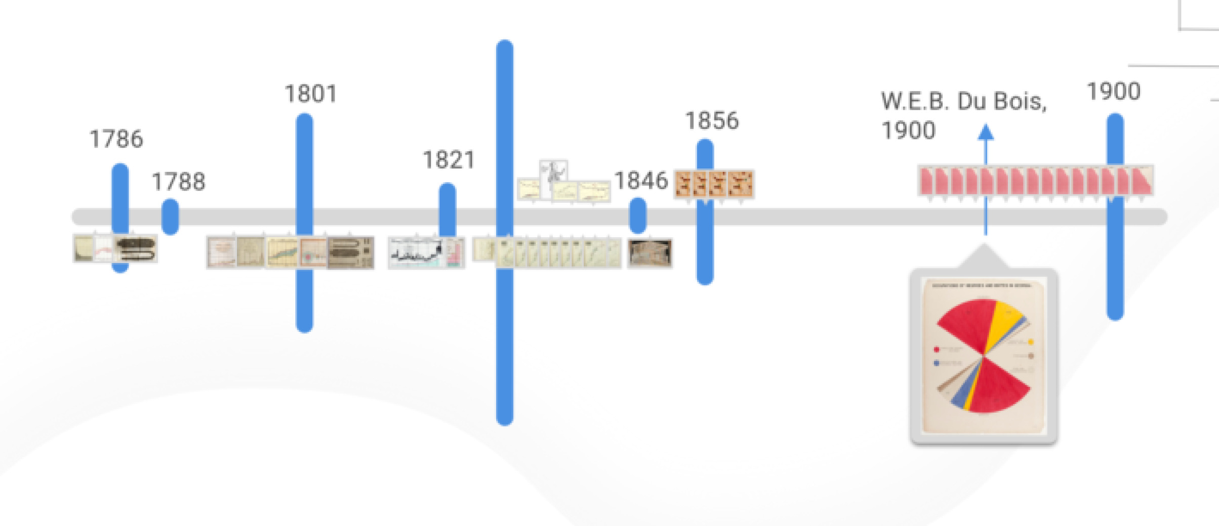
This lesson came home to our project team in the waning days of summer 2021 as we iterated on the design for the front page of this site. Ever since the first prototype of Data by Design, there had always been a prominently-positioned timeline to welcome visitors to the site—first an actual line, then illustrated with images, and then a more desigerly version that arranged each year’s images into artfully arranged stacks. The emphasis made sense: this project has a distinct chronological arc. It looks at how ideas from the seventeenth and eighteenth centuries, when the concept of data had just begun to crystalize, inform the twenty-first century, in which we generate data with our every waking moment (and sometimes even with our sleeping ones). And it explores examples from the eighteenth and nineteenth centuries, when the idea of visualizing data was itself an innovation, connecting them to the present moment in which anyone with an internet connection and basic software can go from data to chart in a series of clicks.
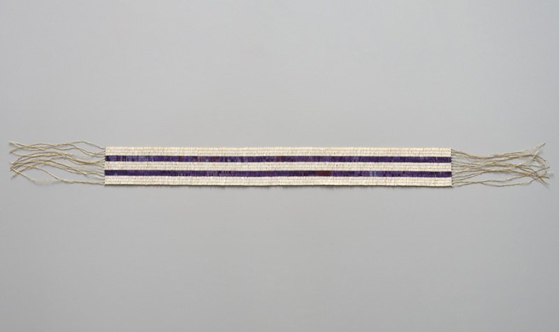
But the timeline wasn’t sitting right. For one, there was the issue of which years to use as its start and end points. Even as this account begins at the dawn of what’s been called the “first golden age” of data visualization, we remained aware that there were earlier instances of data visualization than those we’d chosen to explore. The Inkan practice of quipu, for example—a technique of recording quantitative information as knots on strings—has been recorded as early as 250 B.C.E. Even limiting ourselves to North America, where the majority of our team members are based, there exist an abundance of examples of wampum belts being employed by Indigenous nations to encode political relations—most famously, by the Haudenosaunee—and those date to at least a century before the beginning of the story that we tell here. Should those earlier examples be included on the timeline, even if they were not directly engaged? And what of all the years inside the span of the timeline that lacked examples? While others have attempted to provide comprehensive accounts of the “milestones” of data visualization, and even of the evolution of the timeline itself, the goal of Data by Design has always been to contribute depth rather than breadth, complexity rather than comprehensiveness. As visitors to this site will soon learn, a guiding principle of this project is that history is always—and, crucially, constitutively—incomplete. But when looking at a timeline, empty space is empty space, and it’s very difficult for gaps in the data to be interpreted as anything but absence, even if we know that the reality is more complex.
“What if we foregrounded the images?” proposed Tanvi, who was then a graduate student at NYU, and who had joined the team earlier that year as the project’s lead designer. She shared her screen, walking us through a possible layout in which the images were arranged according to their year of creation, with the year—rather than an actual line—serving as a visual anchor. We all appreciated how Tanvi’s design preserved the overall chronology but eliminated the empty space. It seemed like we were getting closer.
“We could make the timeline scrubbable,” said, then an undergraduate at Georgia Tech and, for the past several years, the project’s lead developer. His suggestion, to display only a few images on the screen at a time and allow the user to control the movement of the timeline with their finger or mouse, would address the issue of where to start and end. It would also send a strong opening message about each user being able to shape their own experience of the site, and would align with one of the project’s main conceptual contributions—that telling a story necessarily involves choices, and invites each of us to ask who is able to tell this story, and to what ends?
The scrubbable timeline seemed promising too. And it would also involve some technical challenges, which was a bonus for Jianing, who’d recently graduated from Georgia Tech and had just started a masters’ program at Berkeley. She’d been a developer on the project since its very first iteration, and had always owned the implementation of any features on the front page.
But for reasons that none of us could fully articulate, the design still somehow felt unsatisfying. There was something deeper that we wanted to convey…
And that’s when it came to us. It was during one of our weekly full-team meetings—virtual, of course, since college campuses had only just returned to in-person instruction, and almost everything else remained online. No one can remember who said it first. But whoever had the idea, we all recognized it a collective “ah ha moment”: we should start with a shuffle.
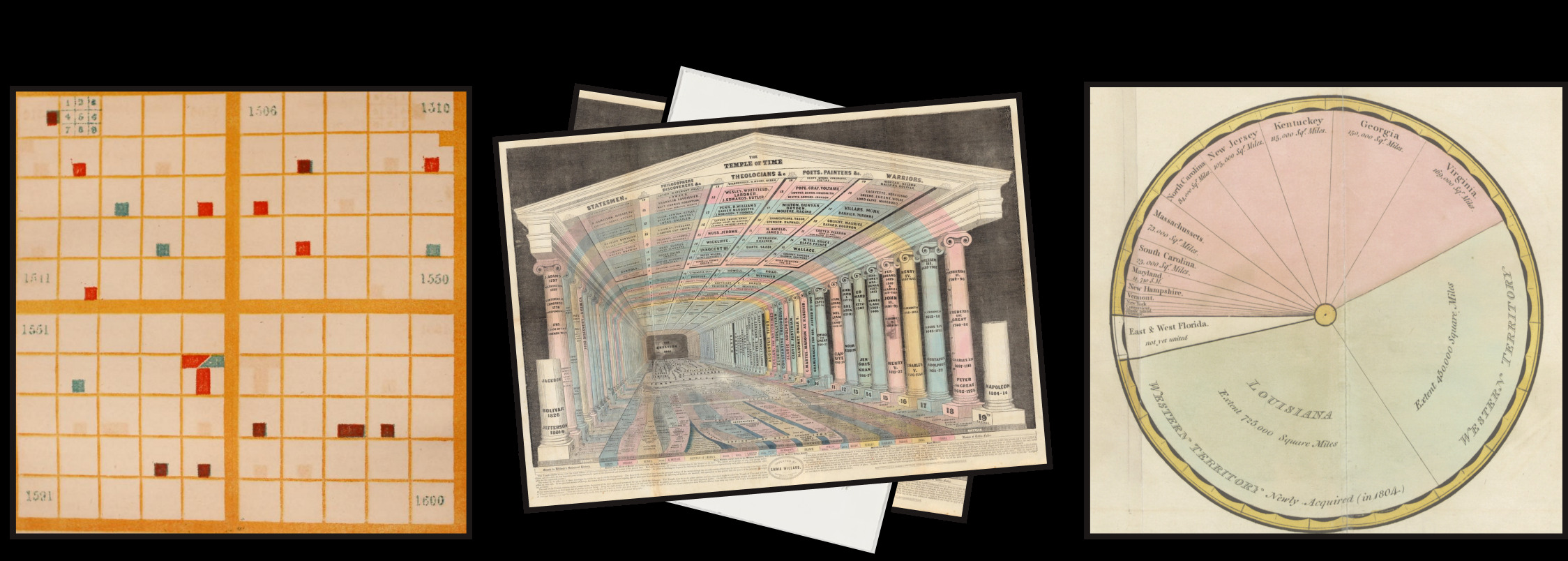

The genesis story of modern data visualization, as it is generally told, begins in a Europe under the thrall of the Scientific Revolution. These numerous advances, across astronomy, physics, mathematics, biology, chemistry, and more, were bound together by their belief in the value of knowledge gained through empirical evidence—that is to say, through evidence gained through experimentation, observation, and other forms of direct sensory experience. Knowledge was no longer just handed down from the heavens, divinely received, but was something that could be directly perceived.
While this empirical evidence could be registered by any of the senses, the sense of sight retained the primary status that it had long enjoyed. After all, it was by observing the night sky that Galileo was able to confirm the phases of Venus and the existence of mountains on the moon. Fifty years later, in England, in an experiment canonized by historians of science (albeit less memorable to students of high-school chemistry) it would be by recording his own observations about his self-fashioned “air pump,” and inviting members of the public to do the same, that Robert Boyle developed his law describing the relationship between the pressure and volume of air. These experiments’ clear contributions to scientific knowledge, combined with the empiricist philosophies that legitimized them, provided both the evidence and the epistemological framework for more and more people to begin to consider how they might acquire knowledge through what they saw.
,While there had been earlier examples of chart-like forms—an anonymous tenth-century diagram of the changing locations of constellations in the night sky, and a set of fourteenth-century charts of the relationships between quantities created by French philosopher Nichole Oresme are often cited—it was René Descartes who first had the idea of “representing points, lines, and geometric figures by equations that could be visualized in diagrams and used to solve problems.” This conceptual leap encouraged a particular slice of elite thinkers—such as the perfectly named Robert Plot, also, incidentally, credited with discovering (but not identifying) the first dinosaur bone—to begin to plot other forms of numerical data, such as barometric pressure (Plot’s subject), mortality statistics (Christiaan Huygens’s), soil temperature (Johann Lambert’s), and financial data (William Playfair’s). And so with this increasing array of visual examples, a growing abundance of data, and an increasingly pervasive empiricist worldview, the flowering of data visualization was set to begin.
Or so the story goes.



But there is another version of this story that can be told, a version that is largely ignored in our typically triumphant accounts of the rise of a visual way of reading the world. This account also begins in Europe, also in the exploratory air of the Renaissance, but it involves men who, instead of fixing their eyes on the heavens, set their sights on the seas. With an initial goal of discovering oceanic trade routes to India, and bolstered by the prospect of spreading Christianity as well as of acquiring goods for future trade, these explorers—Christopher Columbus the most infamous among them—set the era of European colonization in motion. Between the sixteenth and eighteenth centuries—the very same time-span as the account above—Spain and Portugal, with English, France, and the Netherlands shortly behind, sought to establish colonies in the Americas that would enhance their economic, territorial, and political power. These efforts, as we know, inflicted disease and outright violence on the estimated fifty to one hundred million Indigenous people who already inhabited those lands, reducing the population of the Americas to one tenth its previous size over the next century. In so doing, these colonial powers also established the foundation of “conquest and genocide” that, as Indigenous environmental studies scholar Max Liboiron (Métis/Mechif) explains, continues to structure the forms of colonialism that persist today.
The project of colonialism, with its emphasis on the acquisition of land and the extraction of resources, may seem an actual world away from the origins of data visualization. But the links between them are many. For one, European colonial expansion was fundamentally dependent on visualizing data, in the form of mapping, in order to create navigational aids for would-be explorers and to assert claims over the land they sought to possess. Some of the earliest examples of “data maps”—or “thematic maps” as they are known to cartographers—date to this era, including Edmond Halley’s 1686 diagram of trade winds overlaid on a map of the world, which Tufte cites as among the earliest examples of “placing a measured quantity on the map’s surface at the intersection of two threads [of latitude and longitude] instead of the name of a city.” Two centuries later, the “data map” would reach its apotheosis in the exemplary settler-colonial state, the United States, if the form of the lavishly designed statistical atlases commissioned by the Census Bureau. These atlases, starting in 1870, advanced state-of-the-art visualization techniques in the service of a narrative that equated American progress with western territorial expansion. As historian Benjamin Schmidt has argued, the idea of manifest destiny was itself an argument made more via data visualization than it was via actual data, since the data showed far less uniform western settlement than the narrative of progress that Frederick Jackson Turner and others sought to advance.
The map created by Shanawdithit has already exposed us to an additional phenomenon of colonialism that bears particular relevance to data visualization: how the colonial desire to extract profit from resources first required the extraction of knowledge about those resources.
But as an example that coincides with the chronology here, we might consider the famed 1580 map of the Spanish-colonial municipality of Teozacoalco, located in what is now the Mexican state of Oaxaca, which was created by an unknown Mixtec artist at the request of a local Spanish official, who himself was responding to a request from his King.

This request illustrates a conceptual convergence between the European colonial project and the rise of empiricism; in other words, between our counterhistory and the standard story of the emergence of data visualization. For the request made to this particular corregidor was one of many; in an attempt to collect information about the geography, resources, and cultures of the colonies he sought to govern, King Phillip II of Spain had issued a large-scale survey to all officials of New Spain. He asked questions about the terrain, its natural resources, and its demographics, he demanded quantitative data as well as qualitative responses. As a result, the Relaciones Geográficas, as the survey would come to be known, has earned the distinction of being the first (known) statistical study of the Americas. More to the point of the story told here, however, was that King Phillip approached the task of gaining knowledge about his colonies in a method very similar to how Galileo approached the sky or Boyle the air pump: through empirical evidence. The King’s motivation for the Relaciones reflect his belief that data—direct observation and, the reason for its inclusion here, expertly drawn maps—would lead to more complete knowledge of, and therefore more effective rule over, his domain.
In the case of Teozacoalco, the map returned to King Phillip gave him far more knowledge than he could have anticipated, in the form of its expert blending of Mesoamerican pictorial devices with European mapmaking techniques. It makes use of multiple dimensions, and both genealogical and geographical data, to produce a “space-time-story graphic” of precisely the kind that Tufte extolls. Unlike Minard’s flow-map, however, the data depicted in the Teozacoalco map encompasses a far longer time-span than a single military campaign; it depicts the lineage of region’s ruling elite over multiple generations. The genealogy of rulers can be found on the left-hand side of the chart, with the Mixtec calendar system used to identify key dates. A thick brown line connects the rulers to a globe-like form, representing the totality of the municipalities they presided over. Additional lines between the towns indicate their borders, with additional features of the landscape drawn out—evidently with such accuracy that it has enabled present-day archaeologists to pinpoint the locations of these historical towns. In this way, the chart endures as a record of pre-colonial history and culture as much as it does of the force of imperial encounter. This is one of the many paradoxes of the colonial archive: Indigenous artifacts produced in the service of the colonial state are the ones most likely to survive. Within the history of data visualization, however, this map reminds us, in the form of its striking aesthetic hybridity and informatic depth, that it—like all maps and, as we will soon see, all data—cannot be fully understood without reckoning with the context outside of the frame.
In the seventeenth century, as the economic ambition of the European colonial class continued to grow, they required more and more labor to convert their land and the resources it contained into profit. These labor demands were first met through a combination of indentured servants who traveled from Europe out of their own volition, and enslaved workers who had been forcibly captured both from local populations and from abroad. But as the century unfolded, and especially in the Caribbean, as sugar plantations proved such an economic boon, the capture and enslavement of African people—and the brutality and degradation that it was premised upon—would increasingly become the primary means by which the labor demands of the plantation system were sustained. This odious model—of the forced extraction of labor, and also knowledge, from those with darker skin—would not only motivate the establishment of new plantations in what would later become the southern half of the United States, but also set in motion the development of the idea of Blackness as a “biological racial essence viewed as immutable, heritable, and determinative” that, as historian Tiya Miles explains, “fully mature[d] into the zealous arguments of nineteenth-century scientific racism and the vehement politics of twentieth-century American Jim Crow.”
As we will discover over the course of this project, the idea of data, as well as the epistemological value of its visual display, are more closely connected to the rise of slavery, to the modern conception of race, and to modern racism, than we would like to believe. To understand these imbrications, we must first consider how colonialism, which provided European nations with the land and resources that they could then exploit, was complemented by the economic model of mercantile capitalism, which justified its pursuit and which allowed the world order it established to become permanently entrenched. Capitalism in its range of guises—including racial capitalism, to be discussed more below—was and remains what authorizes colonial powers to continue to accumulate wealth and resources, and in the process, enforces a view of objects, actions, and even people in the world as “goods”—items that can be converted into data, items that can be reduced to a price.
Because the word “data” did not achieve widespread usage until the eighteenth century, it is often spared association with racial capitalism. But when looking at what Mary Poovey terms the “epistemological unit” of data, as opposed to the word itself, a clear link between data and capitalism begins to emerge. As with colonialism, this connection is both concrete and conceptual. First, concrete: in addition to the notebooks filled with temperature readings that inspired Johann Lambert to create his time-series charts, and the bills of mortality that provided Christiaan Huygens with the data he required to create his population curves, there were also the double-entry ledger books that, as early as the 1490s, merchants employed to record credits and debits—that is to say, the data of capitalism—in orderly, column-like pairs. As is true of the long history of data visualization, there also exist earlier examples of data tables—far earlier, in this case; the earliest known examples date to 3500 BCE, in the Neolithic cities of Sumerian Mesopotamia. But the crucial difference between the mercantile ledgers and earlier examples, as Poovey has argued, is how the double-column format lent an air of objectivity to the data; it allowed the numbers to become detached from those who had inscribed them, and—crucially—to become interchangeable with other numbers that represented other quantities and prices of goods—goods that, at times, took human form.
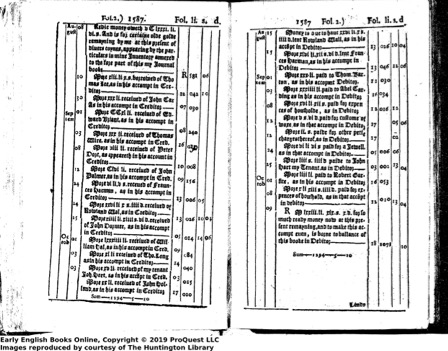
The earliest versions of these ledger books still included a substantial amount of descriptive text, but it was not long before the data table, like the numbers it contained, came to stand on its own. In the eighteenth century, examples abound of tables documenting credits and debits, profits and losses, and costs and counts—not only of saleable goods, such as fruit or fabrics, but of also of people. The table below—from 1770, and part of a diagram of a French slave ship, which we’ll explore in Chapter 1—presents its data in this by-then standard tabular form. The largest section, on the left, provides a breakdown of the counts of various “items of trade,” indicating which were intended for sale, as gifts to the king, consumed along the way, and so on. But next to that section, in near-identical form, is another table which lists “Products of Loango,” a pre-colonial African state located in what is now Republic of Congo. These numbers here refer to people, a count who perished and who survived.

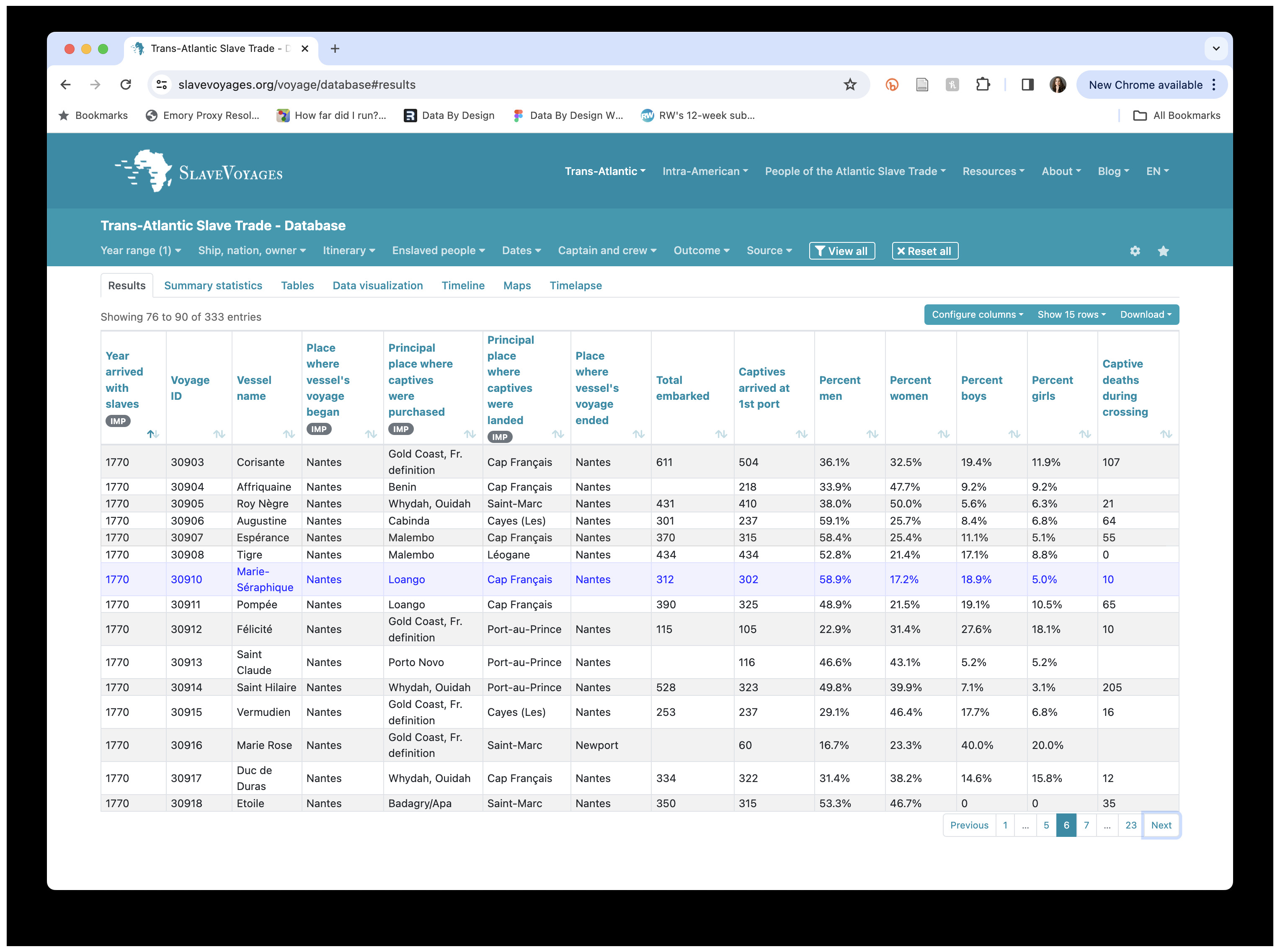
This visual presentation of people as data—a literal headcount, as Margy Adams has observed—reinforces the claims made by scholars of slavery, such as Jessica Marie Johnson, that data itself “is the evidence of terror, and the idea of data as fundamental and objective information… obscures rather than reveals the scene of the crime.” Johnson probes the uneasy link between these data tables and contemporary digital databases, such as the Trans-Atlantic Slave Trade database, pictured below, which employs digitized versions of the very same data—represented, moreover, in the very same columns and rows—in the service of gaining knowledge about the past. This knowledge is at times sought out by present-day descendants of the enslaved, for whom the information contained within historical data tables and related shipping logs—the port of origin, a captive’s gender and age—often, perversely, represents the best chance of leaning about their own family’s past. And yet, as Johnson reminds us, “there is no bloodless data in slavery’s archive”: any present-day attempt to engage with this data must be undertaken in full awareness of this fact.
These troubling links—between the clarion call of data, and the worst impulses of humankind—continue into the nineteenth century, with the rise of scientific racism and in turn, the co-emergence of eugenics and modern statistics. Carrying this context into the present, it comes to apply to data work as a whole. As we contemplate what can be learned through data analysis and its visual display, we must also always consider the context—and very often, the humanity—that is stripped away.
There is a final conceptual connection to capitalism, and to slavery, with which those who work with data must contend. This has to do with the core economic theory of capitalism, and in particular, how it is premised upon an abstraction of human labor into its economic or “exchange” value, which in slavery finds its most heinous form. In his account of this era of capitalism, Ian Baucom employs the powerful example of another slave ship—this one British, the Zong—which made a series of navigational errors while crossing the Atlantic, resulting in a shortage of food and water for the captives and crew on board. The captain then performed a cost-benefit analysis, ultimately leading him to the decision to throw the captives overboard, killing them, so that the crew members could consume the remaining food and water themselves. As Baucom explains it, this decision was made because the captain calculated that he could collect enough insurance money on his captives’ loss of life to profit, even if he couldn’t sell them once they landed ashore. For Baucom, as for other critics of capitalism, the blatant inhumanity of this decision exemplifies the dangers to which the abstraction of labor into “exchange value” leads. For those of us who work with data, the Zong continues to carry a cautionary tale: about the fundamental importance of attending to the lives behind the data, even as our tools and methods—those “technologies of distance,” as Theodore Porter famously called them—have largely been designed to strip that humanity away.
Our narrative follows a chronological arc from the final years of the eighteenth century—what is considered the dawn of modern data visualization—and continuing up to the turn of the twentieth century, when the “golden age” of data visualization began to crest. Each chapter contains both historical visualization examples and new visualizations, designed by our project team, intended both to animate the particular argument that the chapter sets in motion, and to demonstrate the possibilities a more contextualized—and therefore more accurate, as well as more just—approach to visualization design. While the chapters have been designed to stand alone, and can be read in any order, the sequence of the first two chapters is intentional.
Chapter 1 is centered on the indelible image of Description of a Slave Ship (ca. 1789), which visualizes the data of the slave trade by depicting each anguished body that the numbers represent. By beginning with this image, and not any of the more canonical examples often shown, I seek to set the story of data visualization on a path that will require those who design (and perceive) them to consistently consider their visualizations in relation to the lives the data seeks to represent. The “instantaneous impression” that the Description was designed to evoke—notably, a very similar goal that William Playfair, in near-identical language, intended for his charts—also helps to mobilize a larger argument about visualization as a double edged sword: its power, on the one side, to distill complex information into efficient insight; and its potential for harm, on the other, in how the abstraction required to distill this insight often comes at the expense of the details of the data and the context in which it was produced.
With this key tension of data visualization firmly in place, William Playfair’s time-series charts look quite different. Analyzing the components of his charts alongside the text that introduces the third (and most widely circulated) edition of his Commercial and Political Atlas (1801) confirms how the political instability brought about by the Age of Revolutions—as much as an adherence to Enlightenment empiricism—inspired his influential visualization techniques. By recreating Playfair’s charts with a contemporary visualization library, D3, I show how the data-lines of his charts—so often upheld for their accuracy and objectivity—in fact embellish the story told by the data alone. Far from delegitimizing the value of his charts, this finding serves to advance this project’s core claim: about how an attention to context—historical, political, and in this particular case, material—allows us to learn more and not less about the data they contain.
Chapter 3 moves from England and Scotland, where the Description and Playfair’s time-series charts were created, to North America, where the central examples of all subsequent chapters take shape. This chapter is where Shanawdithit’s narrative maps (ca. 1829) take center stage. The argument I make here is both more subdued than the previous chapters and more profound: all visualizations that we create—and not just those explicitly enlisted in the service of empire—must be considered with a colonial frame. This chapter also asks us, as (majority) settler researchers and designers, to consider our own work in the context of colonialism. We ask difficult questions about the uses of data, visualization, and knowledge itself. The lessons of this chapter have more to do with the limits of data visualization, and the limits of knowledge, but they are no less important to behold—for they teach us about our obligations to our work and to the people and land who enable it, and about what we cannot, and should not understand.
If the emphasis of Chapter 3 is the limits of our knowledge, Chapter 4 opens the door to future possibilities. Its focus is on the chronological grids of educator and editor Elizabeth Palmer Peabody, which employed color and position in order to represent historical events in time. Peabody’s charts, as described her Polish-American System of Cartography (1850) and documented in her Chronological History of the United States (1856), were designed to be abstract rather than intuitive; to promote sustained reflection rather than immediate insight; and to provoke a unique imaginative response in each viewer. These are each principles that diverge sharply from the positivism that has shaped visualization best practices to this point. This chapter uses the example of Peabody’s alternative epistemological viewpoint to ask us to consider what additional visualization strategies we might create—and what additional knowledge we could gain—if we expanded our very understanding of how visualization could be deployed.
Chapter 5 takes us up to the century’s close, considering the charts designed by the esteemed sociologist W.E.B. Du Bois and his team of students from Atlanta University for the 1900 Paris Exposition. Recently reclaimed by historians of data visualization as a corrective to their otherwise dominant accounts, Du Bois’s charts in fact tell a more complex story—one that acknowledges the uses of data visualization at the same time as its limits. By exploring his charts in the context of his writing on race and racism and his sociological theory, and by recreating the charts in ways that account for the students whose knowledge and labor helped to shape them, we close with a reassertion of how data visualization, the conceptual conditions of its emergence, and its political consequences, are fundamentally intertwined. Drawing a discussion of race, data, and political agency into the present, the chapter concludes with an optimistic consideration of what data visualization can accomplish. If we acknowledge the perils of data as well as its promises, visualization can do more than illustrate our world; it can bear witness to instances of oppression at the same time that it can—if intentionally designed—hold space for what cannot be conveyed through data alone.
A postscript hones in on the issue of labor, a through-line of the project overall. It takes as its focus not the history of visualization but its practice in the present—the making of Data by Design itself. While the words on this page are written by one person, Lauren Klein, a professor of digital humanities and data science with scholarly expertise in the eighteenth and nineteenth centuries, the visualizations and other interactions that animate my written arguments have been designed collaboratively, and have been implemented by an intentionally interdisciplinary research team—one with expertise that spans the fields of art and design, computer science, and literary, cultural, and media studies. As this project has evolved, and as the team itself has undergone multiple iterations, we have come to see ourselves and our own process as illustrative of the ideas animated by the historical examples, and this final chapter represents our attempt to document our work and credit all contributors, while providing the first example of how the lessons of Data by Design can find form in contemporary visualization work.
We are a team of visualization designers, software engineers, and humanities researchers. We have always intended for the ideas of this project to be put into use—we created this book to help visualization practitioners, both in academia and industry, to design their visualizations in more effective ways. At the same time, as should already be clear, we believe very strongly in the value of historical, social, and political context—both as it informs the practice of data visualization and as a pursuit in and of itself. Humanities scholars will likely recognize the major historical themes and theoretical frameworks that animate this book; we hope that they will be invigorated the application of these themes and frameworks’ application to contemporary questions of visualization design. And digital practice more broadly. We hope that visualization researchers, in turn, will come away with expanded knowledge of the history of their own field, and an appreciation for how the power of visualization—for that we do not dispute—emerges from a much broader set of cultural, scientific, and political ideas. Finally, we hope that visualization designers and other practitioners will find inspiration in the range of historical images that illustrate the book, as well as in the visualizations that we ourselves have designed. Our arguments are often serious, revealing how the history of data visualization is intertwined with the histories of slavery, capitalism, and colonialism. But in surfacing this history, our goal is not to suppress the use of visualization or to limit its future growth. On the contrary, we seek a more informed and more intentional, and because of this, a more precise and effective practice of data visualization, both in our own work and in that of our readers. This practice is one that prioritizes the particularities of each dataset, that considers its social, political, and historical context, that attends to the people who made it possible, and that continually recalls the power—and, therefore, the responsibility—that we hold as designers of visualizations ourselves.
Finally, if you have read this far, thank you. But please also keep in mind that the version of the project that you are looking at is a working draft. We anticipate completing a full revision of the project by the end of Summer 2024. If you have comments to share, please click the white square at the top right of the page to leave feedback directly on the site. Or you can email the project director, Lauren Klein, at lauren.klein@emory.edu, and she will share your message with the project team.