There is a now-famous photograph, yellowed by age, which was taken in Paris in the spring of 1900. No people appear in the photo. Instead what appears is a low bookcase, its shelves lined end-to-end with books large and small. The top of the bookcase, at counter height, is stacked with more books, pamphlets, and other artifacts, intended to be perused. And above the bookcase are charts—dozens and dozens of them—along with photographs and additional artifacts, each installed in a picture frame or swing-out vitrine, and mounted in rows reaching up to the sky.
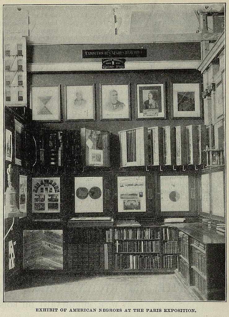
The photograph documents the exhibit that W.E.B. Du Bois (1868-1963), the field-defining sociologist, author, and activist, designed for the 1900 Exposition Universelle. The “American Negro Exhibit,” as it was called, was the result of over a year of campaigning, reaching up to the President of the United States, to include the contributions of Black Americans as among the other celebratory displays of national might and ingenuity that were typical of World's Fairs at the time. Du Bois and his co-curator, Daniel A.P. Murray, then the Assistant Librarian of Congress, were given the southeast corner of the U.S. exhibition space in the Palace of Social Economy and Congresses—what visitors would have seen immediately to their right upon entering the hall—and went to work. While Murray tasked himself with assembling a set of books by Black writers to put on display, Du Bois saw his purview in more conceptual terms: to present “the history and present condition of a large group of human beings”—namely, the nation's Black citizens—"in as systematic and compact a form as possible.”

This “systematic and compact form” was, of course, data visualization—a technique that Du Bois had first encountered a decade earlier during his graduate study in Germany, and that he'd perfected more recently in Philadelphia, where he lived with his wife Nina, in 1896, as he collected the social surveys and other data that would culminate in The Philadelphia Negro. Du Bois had since moved to Atlanta to take up a position as a professor of sociology at Atlanta University, and because time—and money—was already running short, he enlisted the expertise of William Andrew Rogers, who had graduated from Atlanta University the year before, as well as the four students then enrolled in his year-long sociology course. Together, Du Bois and his team created the create 63 poster-sized charts—each a dazzling display of trenchant data analysis and inventive graphic design—that would travel to Paris in several months' time.
Like Thomas Clarkson, William Playfair, and most data visualization practitioners ever since, Du Bois appreciated the ability of visualization to convey significant trends and patterns—in his words—“at a glance.” In the case of the charts that he and his students designed for the Paris Exposition, Du Bois sought to highlight one trend in particular: the growth and progress of Black Americans in the years since emancipation. His selection of datasets, combined with his (or his students) masterful deployment of color and form, resulted in a series of charts that were as visually striking as they were sociologically profound. After being digitized by the Library of Congress in 2014, the charts have captivated a new generation of visualization designers and aficionados who see in them evidence of how visualization can be enlisted in the service of justice while also advancing the formal possibilities of the field.
As for Du Bois himself, however, both as a scholar who was then pioneering the idea of mixed-methods research, and as a Black man in the United States, he was deeply attuned to the limits of visualization as well as its uses. His scholarly expertise and lived experience together pointed to the fact that, on its own, data visualization could not hope to convey a complete picture of the progress of Black Americans to date, nor could it convey the extent of the obstacles that were required to be overcome. His incorporation of additional forms of visual evidence into his research, combined with his continued insistence on acknowledging the larger social and political context that framed the work, offer us a model for making change in the world that indeed enlists the power of data, while also acknowledging how our own work is far from complete even after visualizing that data for the screen or page.
Although most of 63 charts that Du Bois and his students created for the Paris Exhibition were displayed on the countertops, available for visitors to peruse in any order they chose, the charts were conceived as two distinct sets. The first, The Georgia Negro: A Sociological Study, focused on statistics that had been compiled by Du Bois and his students that related to the Black population of that state. The second was national in scope. Entitled A Series of Statistical Charts Illustrating the Condition of the Descendants of Former Slaves Now in Residence in the United States of America, this set drew from several data sources, including the US Census, in order to put the Black population of the United States in national and international perspectives.
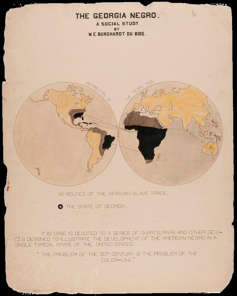
In the exhibition space, Du Bois mounted the introductory chart of each set—a title page of sorts—directly at eye-level against the back wall. Clearly, Du Bois wanted these charts to be seen. Of the two, the introductory chart of The Georgia Negro series was given a particular place of prominence: the center-left position in the row of frames, likely the first image that would catch the eyes of visitors as they entered the room. The image is comprised of a pair of Mercator projections, one of Africa and the other of the Americas, their connection indicated by lines that link key locations, and shading in yellow, black, and brown that suggests additional thematic relationships. As the key below clarifies, what are depicted are the “routes of the African slave trade.” Two epigraphs fill what would otherwise be empty space at the bottom of the chart. The first makes the expository aim of the series explicit: “to illustrate the development of the American Negro in a single typical state of the United States.” The second advances its argument: “The problem of the 20th century is the problem of the color line.”
These words would reappear several years later in The Souls of Black Folk , where they would become “perhaps Du Bois's most famous indictment of the centrality of race and racism to modern American sociopolitical life,” as architectural historian Mabel O. Wilson explains.But his charts make the same assertion in visual form. Both through his choices about what datasets to visualize, and through his choices about how to visualize them, Du Bois advances a clear argument about the nation's Black citizens: about the progress they had made in the years since emancipation, and about the challenges that remained to be addressed.
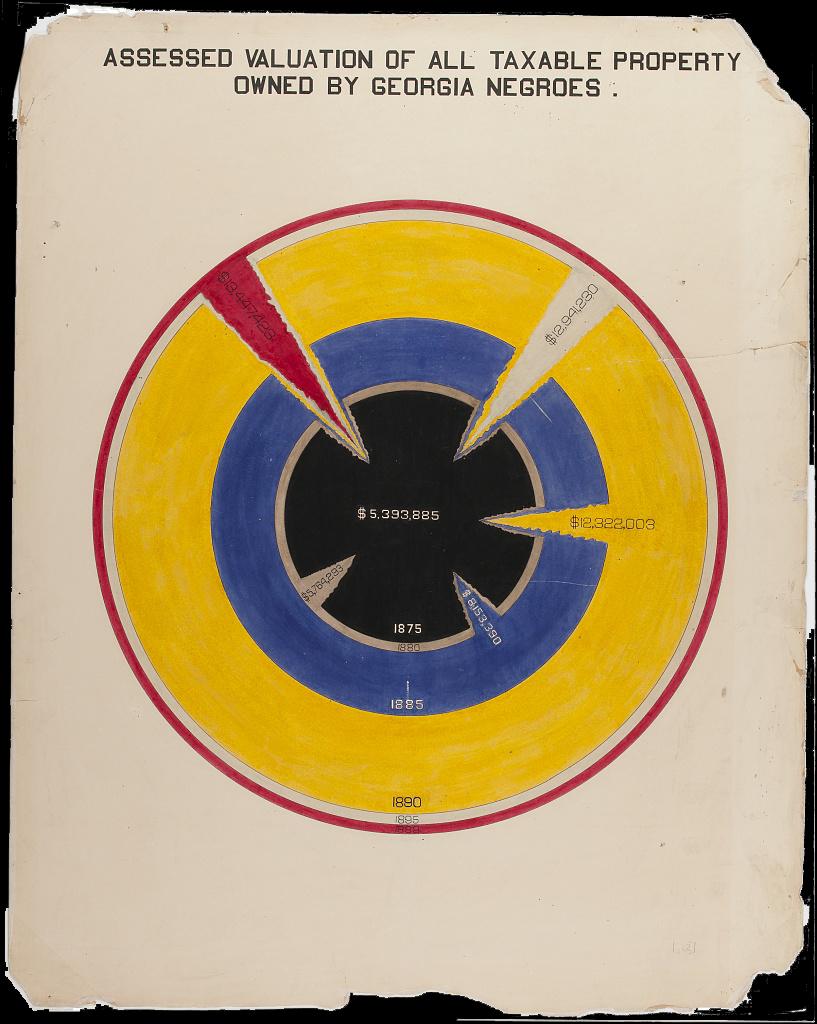
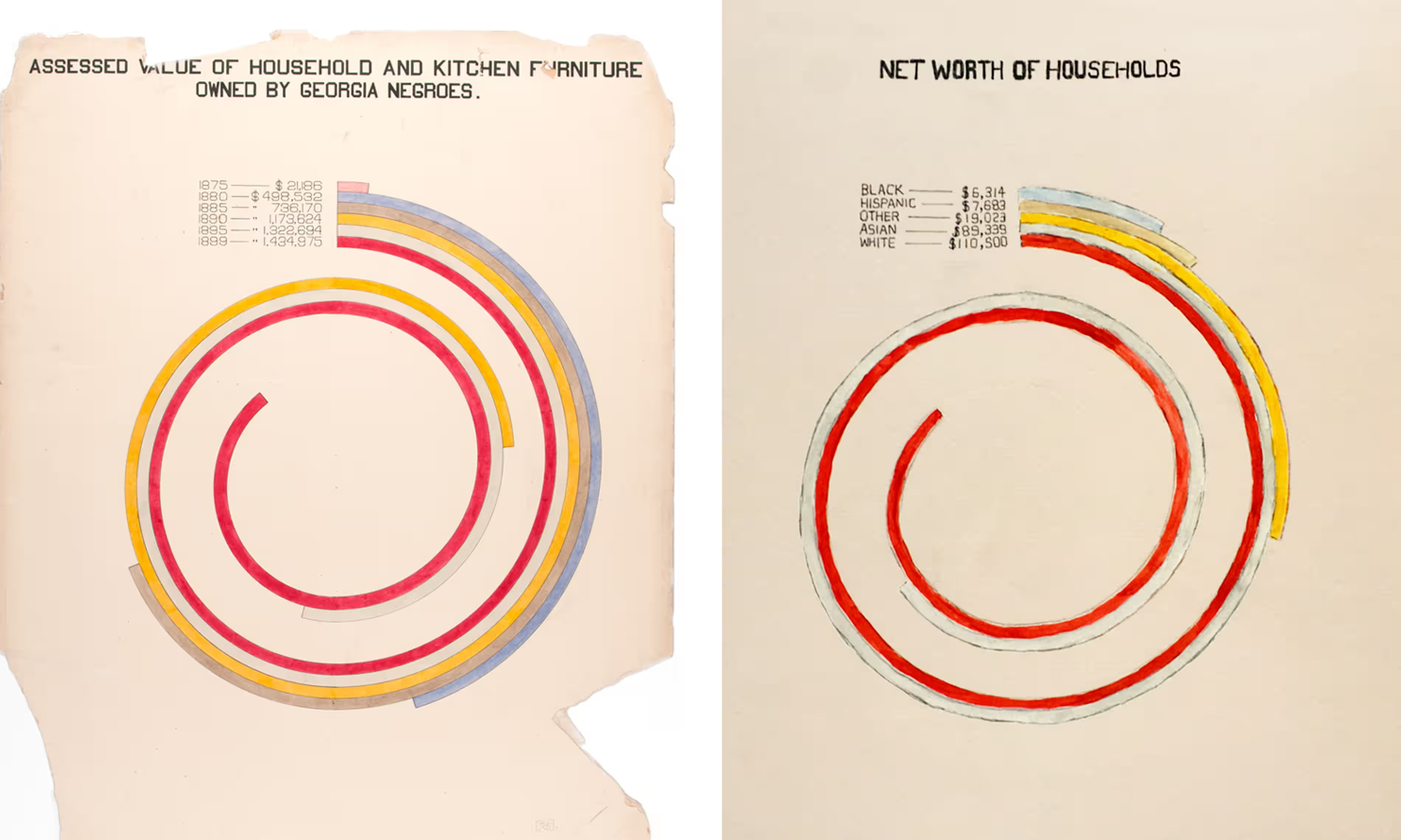
More than a century after Playfair introduced his line charts and bar charts to the public, visualizations no longer required lengthy textual explanations in order to be understood. Even still, Du Bois took active steps to ensure that there would be no mistaking the argument of the charts, about the barriers of racism and the progress made nonetheless, by selecting data to visualize such that in not a single bar or area chart does any measure related to his subject trend down. The Black population of Georgia is shown to increase every decade; the number of Black children enrolled in school is similarly shown to be on the rise; land ownership is documented as growing nearly every year of the previous twenty-five; and the assessed value of Black Georgians' property has exploded so exponentially that it requires a wholly new visual form—a bar chart curved into a spiral—for the most recent values to even fit on the page.
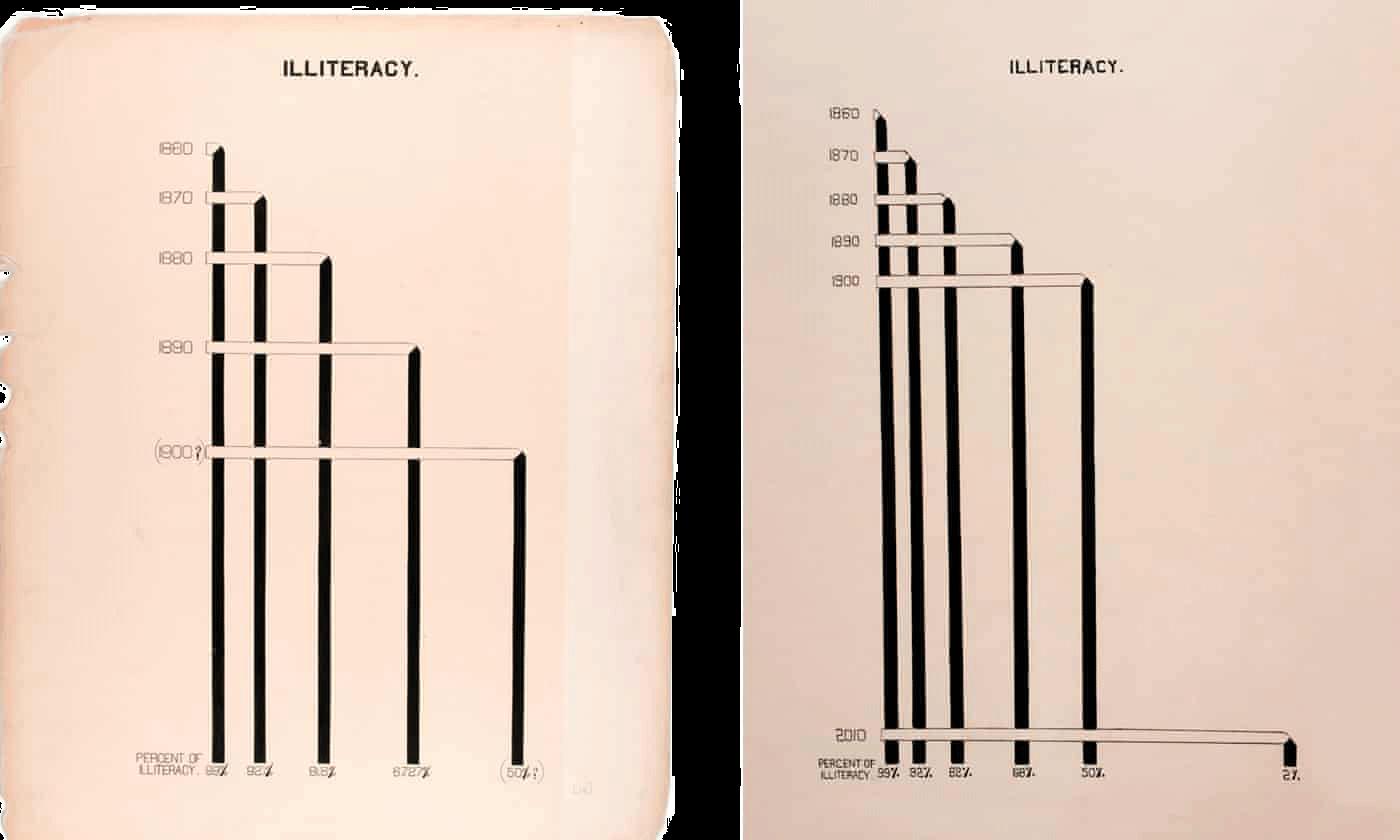
Indeed, in this chart and the others that diverge by then-conventional visualization techniques is evidence of an additional argument that—like Playfair's charts—is made through the intentional choice of visual form. This has to do with the as-yet-realized possibilities for Black life if it were supported in its flourishing, rather than be actively suppressed. Consider how the first several charts in the series make use of familiar visual strategies—maps, bar charts, and line graphs—in order to introduce the exhibition's international viewership to the state of Georgia and its significance as an object of study. But the visual style shifts into new terrain once the focus on Georgia's Black residents has been established. A comparative representation of the places where Georgia's Black citizens reside A comparative representation of the places where Georgia's Black citizens reside is where Du Bois introduces his iconic spiral, for example, bringing together aspects of the bar chart and the line chart along with this new form of circular graph in order to animate the increasing presence of Black people throughout the state. In a later chart in the series, which documents the decrease in illiteracy rates in the years between 1860 and 1900the decrease in illiteracy rates in the years between 1860 and 1900 , Du Bois makes use of what graphic designer (and contributor to this project) Silas Munro describes as a “lattice-like arrangement,” in which an otherwise standard bar is folded at a right angle in order to further accentuate the decreasing rate of illiteracy over time. Du Bois elaborates upon this technique in a later chart, which compares the numbers of Black property owners, and the value of their properties, in two Georgia citiescompares the numbers of Black property owners, and the value of their properties, in two Georgia cities , building upon his own visual language to represent the progress that had been achieved by the Black residents of Georgia in spite of the efforts of their white compatriots.
Compared to the easily interpretable “picture of the past” that Playfair designed his time-series charts to convey, the sequence of increasingly novel visual formsincreasingly novel visual forms that characterizes the Georgia Negro series charts seems to ask viewers to imagine future Black progress through the lens of Black creativity: what might come to be if the future of Black America, like the expressive possibilities of data visualization, were also not curtailed by convention and code. Of course Black Americans had already excelled through all normative measures, the more typical charts easily confirmed. But what else might be possible—in terms of contributions to visualization design, or to the nation—if Black Americans could engineer their own charts, and their futures, unconstrained by the “color line”?
Du Bois continues to affirm these imaginative possibilities through the graphical innovation of the second series of charts, which focuses on the “condition of the descendants of former African slaves now resident in the United States of America,” as its introductory chart explains. In this series, Du Bois was also joined by his students as co-designers, as a later section of this chapter will further explore. Here, what is significant is how, in documenting the upward progress of Black Americans in a national and international context, Du Bois and his students make use of comparisons to other populations—and to other charts—in order to affirm a narrative of progress and possibility with respect to Black Americans' social, intellectual, and economic lives.
A clear but unnamed interlocutor in this series is the US Federal Government, which for each of the three previous national censuses, had created a statistical atlas that visualized the data collected at national scale. The most recent of these atlases, based on the 1890 Census, had been published only two years earlier, in 1898. Most famous today for its visual depiction of the closing of the American frontier—a symbol to the settler-colonial nation that its goals of “manifest destiny” had run its course, and to Native peoples that their displacement was complete—the Statistical Atlas of the United States , based on the results of the eleventh census in its own time was motivated by a more pedagogical goal: “popularizing and extending the study of statistics.”
The atlas was overseen by the then-chief geographer for the US Geological Survey, Henry Gannett, and was comprised of 409 maps and diagrams. The sequence began, just as Du Bois's did, by introducing viewers to the statistics on population statistics on populationstatistics on population T. Through by-then-standard bar charts, pie charts, and line graphs, as well as its own creative use of pattern and visual form, the atlas included, for example, a prototypical bump chart that ranked each state according to its populationprototypical bump chart that ranked each state according to its population ; a map that illustrated the spatial distribution of the nation's male population the spatial distribution of the nation's male population ; and another that illustrated the spatial distribution of the nation's Black population.the spatial distribution of the nation's Black population. . (Another chart usedarea charts in small multiples in order to compare certain states' Black and white populationsarea charts in small multiples in order to compare certain states' Black and white populations ).
While race was certainly of concern in the census—indeed, it remains one of the lighting rod issues of the census even today—it was not the Statistical Atlas's main concern. Reading further into the intent conveyed through the sequence of maps, after an early series of charts that visualize the nation's Black population, the focus of the atlas shifts, turning first to the nation's immigrant population the nation's immigrant population before expanding outward to consider other features altogether: the population's age and gender breakdown the population's age and gender breakdown , the country's increasingly diversereligious groupingsreligious groupings , theoccupations of its inhabitantsoccupations of its inhabitants , and more.
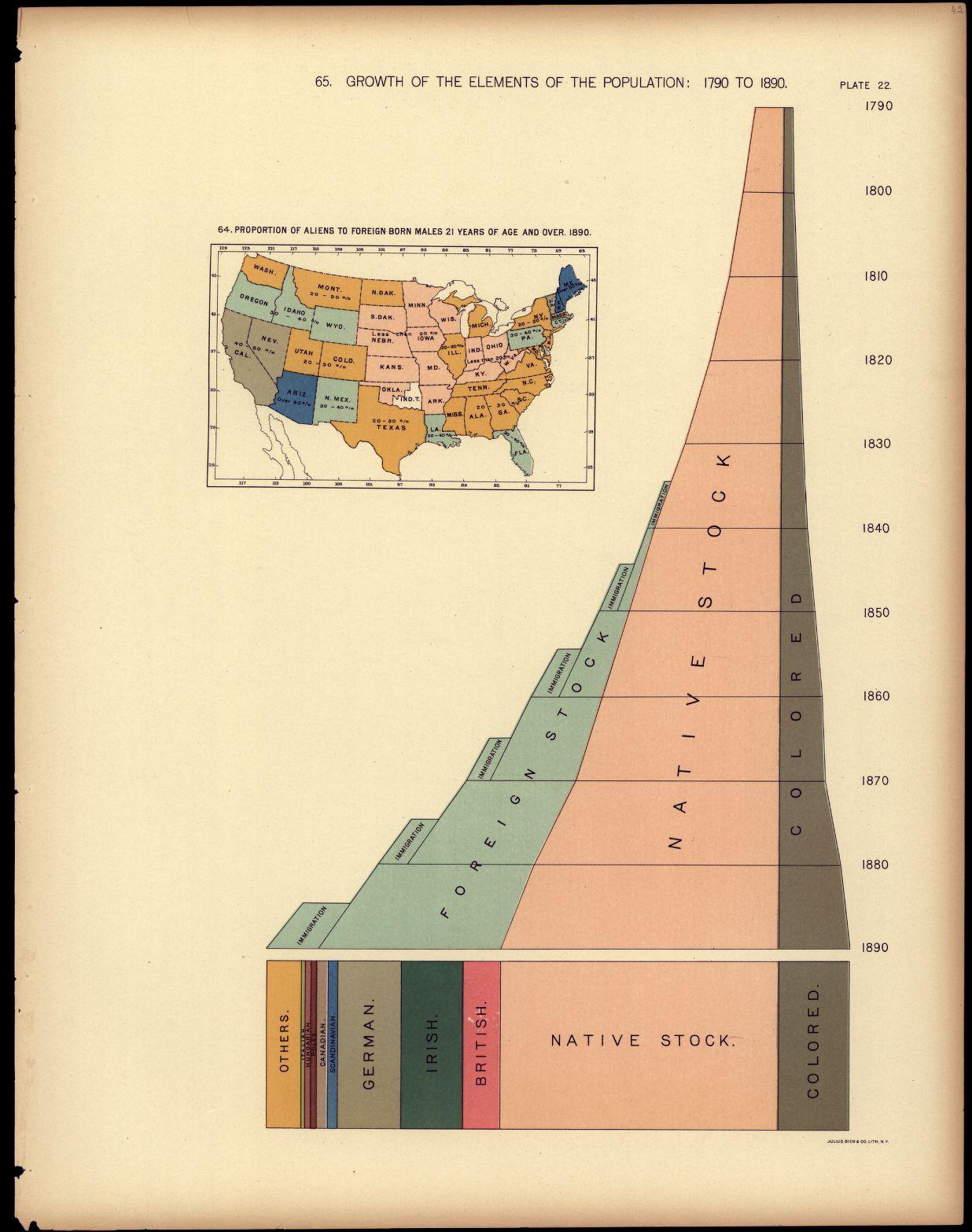
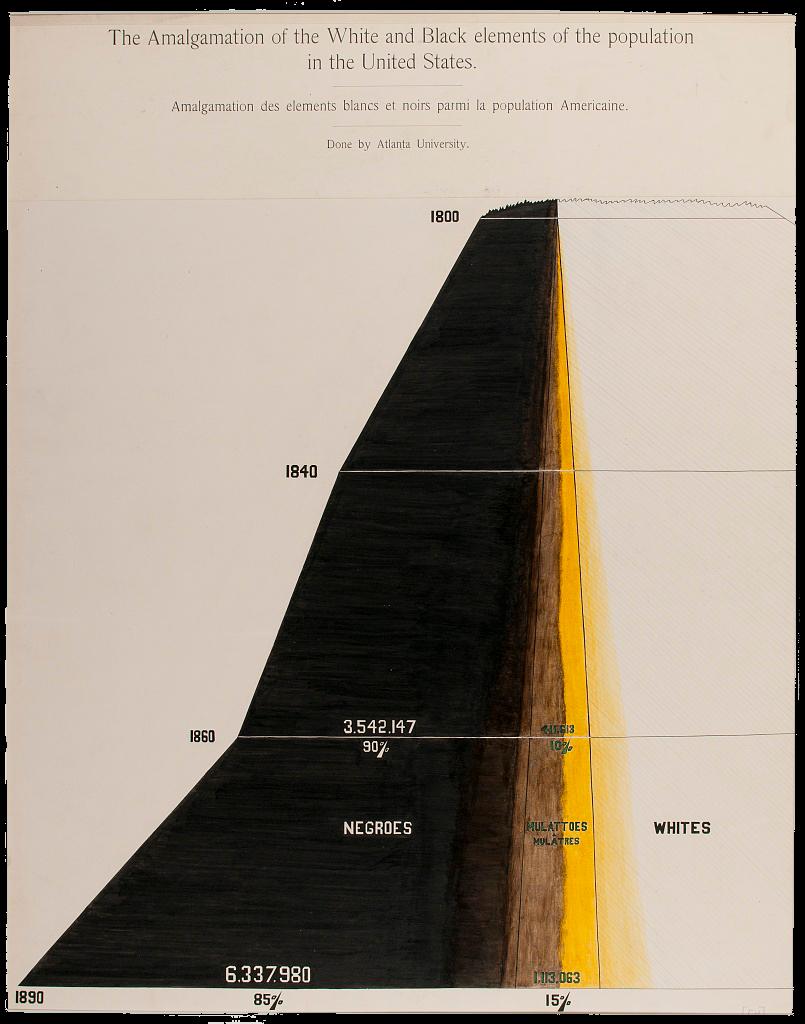
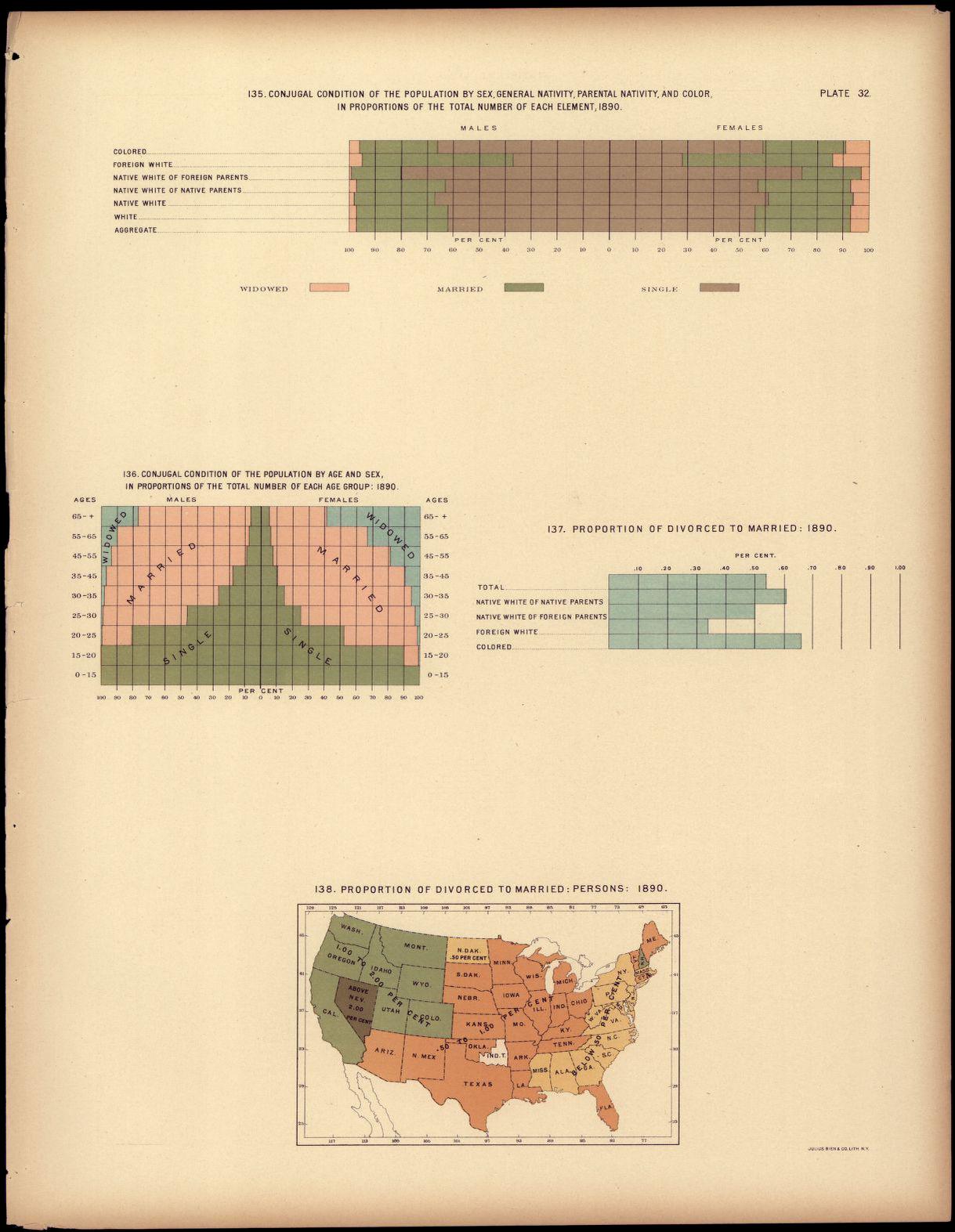
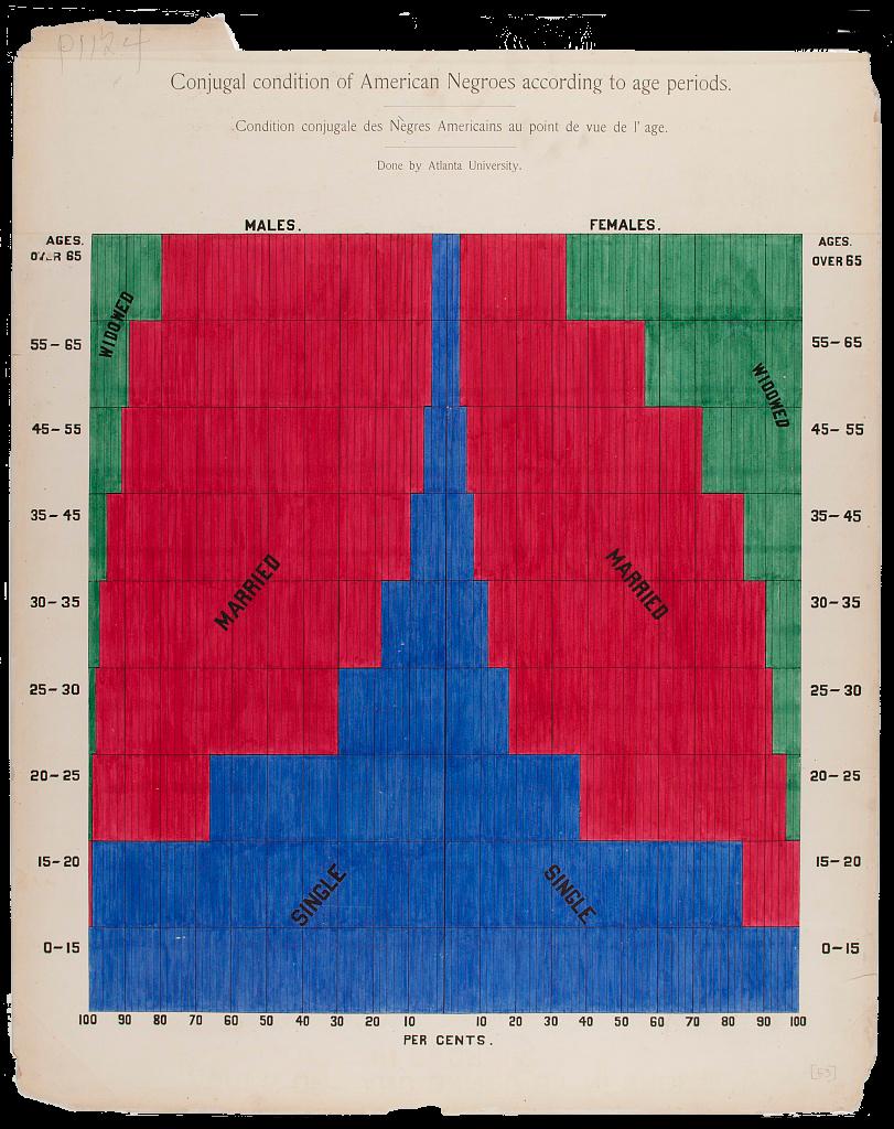
Du Bois's charts were clearly influenced by the Statistical Atlas. Several of his own diagrams mirror the form of those created for the atlas. Du Bois's graduated area chart of “The Amalgamation of White and Black elements of the population in the United States,” for example, takes the same visual form as the chart in the Statistical Atlas depicting “Growth of the Elements of the Population: 1790-1890.” Similarly, the combined area and bar chart form that Du Bois employs for his chart of “Conjugal Condition of American Negroes according to Age Periods” is the very same as the chart in the Statistical Atlas depicting “Conjugal Condition of the Population by Age and Sex, in proportion to the total number of each group.” The notable difference within each pair is, of course, Du Bois's focus on the Black population alone. And for Du Bois, this difference in data was the point: the nation's Black population was itself diverse, and it was thriving. By adopting the visual typologies of the Statistical Atlas in order to make his claims, Du Bois underscores his textual argument about the “small nation of people” within the larger United States by creating a national statistical atlas of their own.
Today, Du Bois's charts are often shared as single images, embedded in a post on social media, or—as in the case of Du Bois's Data Portraits, the 2018 volume that compiled the charts in print for the first time-bound as a dazzling, full-color book. But in their own time, the charts were intended to be viewed in relation the photographs that accompanied them on the exhibit's countertops and walls. And photographs there were—over 500 of them, documenting Black Americans at home, at school, and at work, which Du Bois had commissioned from a fleet of Black photographers from Atlanta and beyond. In a reflection published several months after his return from Paris, Du Bois explains that he included the photographs to challenge “conventional American ideas,” although he does not specify what particular ideas he intended to challenge. Presumably, these ideas included racist assumptions about what the nation's Black citizenry looked like, what social and professional roles they occupied, and the extent of what they could achieve.
In her in-depth analysis of the photographs, art historian Shawn Michelle Smith connects them to Du Bois's idea of double consciousness, “the sense of always looking at one's self through the eyes of another,” as articulated most famously in The Souls of Black Folk.With the photos, which not only featured black citizens but were also created by them, Du Bois sought to present to a predominantly white international audience a view of how Black Americans saw themselves.
Considered alongside the photographs, it becomes possible to understand the charts as pushing back against this double consciousness through an additional visual form. In their discussion of the charts, Battle-Baptiste and Rusert elaborate this line of thinking, emphasizing how Du Bois understood double consciousness as a “kind of 'second sight' that might be transformed from a curse into a “gift” that offered a unique and superior perspective on turn-of-the-century race relations, sociability, and even existence itself.” In direct comparison to the Statistical Atlas, the charts might be interpreted as expressing this “superior perspective” on the status of race in America at the time. Du Bois's narrower focus on the data of Black Americans allowed him to visualize the deleterious effects of racism with more precision, as well as to provide a clearer view of what the nation's Black citizens had, despite this racism, still managed to achieve. Here was the “empiricism of lived experience,” to quote contemporary data activist Anita Gurumurthy, that, for example, Clarkson's “Description of a Slave Ship,” which was designed without the inclusion of the enslaved, clearly lacked.
At the same time, Du Bois's decision to pair the photographs with the charts also points to his awareness of the limits of what either medium could achieve on its own. While the photographs could document the richness of individual lives, they could not possibly document the life of every one of the nation's Black citizens. Conversely, while the charts could present powerful evidence of generalized trends, they could not expose the individual people behind the data, nor could they express the individual stories that reflected the warp and weft of each person's life. Considered as a complementary pair, however, the charts and the photographs recall another visual technology of that era, the stereoscope, whose form is suggested by the double-projection layout of the Georgia Negro's introductory chart. The stereoscope was a device that spliced together two views of the same image, one in each eye, creating the illusion of three-dimensional depth. Similarly, Du Bois understood the charts and the photographs as two parts of a larger whole. While each was legible on its own, the most complete—and therefore most accurate—picture was gained by viewing them together.
This is another version of the epistemological pluralism that the previous chapter, on Elizabeth Palmer Peabody, has explored. But more than Peabody allowed herself to admit in writing, and certainly more than her empirical-epistemological forebears, Du Bois was explicit about the fact that there were aspects of human experience—and therefore knowledge—that data visualization could not ever hope to convey. Indeed, I believe that Du Bois's decision to include charts and photographs alongside each other on the walls and counters of the Paris Exhibition is an outward reflection of his own epistemological soul-searching, an activity in which Du Bois, in the months leading up to exhibition, was deeply engaged-
When Du Bois first arrived at Atlanta University, he was determined to advance a quantitative approach to sociological work. As he recalls in his 1940 autobiography, Dusk of Dawn, “I was going to study the facts, any and all facts, concerning the American Negro and his plight, and by measurement and comparison and research, work up to any valid generalization which I could.” Here we see the strength of Du Bois's belief in the power of “facts”—the more facts the better—when they could be enlisted in the service of inductive reasoning, analyzed and aggregated to point towards larger claims.
But after only a year in the South—and just a few months before he began to assemble the materials for Paris Exposition—Du Bois experienced what can only be described as an epistemological epiphany, one brought about not by any new research but instead by his own first-hand evidence of how white supremacy restricted any and all of the work he might do. In Dusk of Dawn, Du Bois narrates this transformation in almost metaphysical terms: “At the very time when my studies were most successful, there cut across this plan which I had as a scientist, a red ray which could not be ignored.”
This “red ray” was no abstraction. It had a specific and horrific source: the lynching of a man named Sam Hose, which had taken place just outside of Atlanta, on April 23, 1899. Hose had been suspected of killing his landlord's wife, and Du Bois had the idea to write an essay about the case for the Atlanta Constitution, the leading newspaper of the South. He intended to approach it as he would any other inquiry: through a social-scientific lens. He recalls how drafted a “careful and reasoned statement concerning the evident facts.” But while walking from the Atlanta University campus to the newspaper office—he planned to deliver the statement in person—Du Bois learned of a gruesome new turn of events: Hose had been lynched, and his body parts were rumored to be on display in a storefront that Du Bois himself would soon pass on his walk. Du Bois turned around and went home, his statement never to see the light of day.
While Du Bois's desire to publish a statement on the “facts” of the case was extinguished at that point, he continued to contemplate—deeply—the larger function of his research. As he narrates in Dusk of Dawn:
“Two considerations thereafter broke in upon my work and eventually disrupted it: first, one could not be a calm, cool, and detached scientist while Negroes were lynched, murdered, and starved; and secondly, there was no such definite demand for scientific work of the sort that I was doing. I regarded it as axiomatic that the world wanted to learn the truth and if the truth was sought with even approximate accuracy and painstaking devotion, the world would gladly support the effort.”W.E.B. Du Bois, Dusk of Dawn, pp. 67-8.
From these lines—which Du Bois echoes in an autobiographical audio interview recorded in 1961—it becomes clear that he emerged from the incident with a greater awareness of the limits of his inductive, data-driven approach to advancing knowledge, just as he registered the heightened stakes of pursuing that knowledge and communicating it to the public. The violence brought about by centuries of white supremacy, Du Bois realized at that moment, demanded a different epistemological charge: not an adherence to any particular method, but instead a broader attempt to describe “the truth.” Thus when Du Bois turned to the Paris Exhibition in several months' time, it was not facts or data, but instead this “truth”—the experience and effects of living within, continually resisting, and thriving in spite of a racist regime—that Du Bois sought to give visual form. He did this through the charts and the photographs that he installed together on the walls, and in the presence of the Black Codes on the bookcases below.
Du Bois's nuanced consideration of the uses and the limits of data and its visualization, in the context of his larger goal of pursing “the truth,” helps to explain why his charts are often referenced in the context of current conversations about data and its utility for advancing racial justice claims. They are also often, like Playfair's recreated with contemporary tools.” But what is revealed through the process of recreating Du Bois's charts—like the goals of his original research—extends far beyond a demonstration of mastery over the techniques themselves. To be sure, the originality of Du Bois's original forms means that there are far fewer built-in plotting functions that designers and developers can rely upon, requiring an additional outlay of creativity and skill that, for example, recreating Playfair's charts does not require. But Du Bois's substantive focus on topics like income distribution and occupational spread also ensure that recreations of these charts with current data can lend evidence to enduring—and deeply unjust—social truths.
When data journalist and visualization designer Mona Chalabi decided to recreate Du Bois's charts using contemporary data, for example, she discovered that as of the 2010 U.S. Census, “illiteracy among black Americans was still four times higher than it was for white Americans.” Her updating of the chart of “assessed value of household and kitchen furniture” owned by Black Georgians, which led her to additional Census Bureau statistics on net worth, resulted in a picture that documented how, “for every dollar a black household in America has in net assets, a white household has 16.5 more.” Because Du Bois's representational forms have yet to be assimilated into mainstream visualization techniques, they still hold tremendous visual power, allowing them to bear witness through image—as well as data—to the racism and other forms of structural oppression that remain entrenched in US society today.
Other projects seek to adapt the activist intent of Du Bois's original charts to call attention to new issues that have arisen in the years since their creation, but that nonetheless still have racism at their source. For example, the Dignity + Debt Network and the VizE Lab for Ethnographic Data Visualization at Princeton created a series of interactive visualizations to expose the racial disparities in student loan debt in the United States in the style of Du Bois's charts. One tool enables users to enter the amount they originally borrowed, and see that amount compared to the average principle for each major racial and ethnic group. The tool makes use animation to extend and redirect the spiral's original comparative form. Whereas in the original chart, the spiral form concentrates the viewer's focus on the cumulative value of Black Georgians material possessions, the animated plotting of the data-lines here, spiraling out from the center over time, emphasizes the continuing effects of this debt burden. Crucially, it also invites the user to take action. A form below allows them to compare their current interest rate to others, educating them as to how a change in rate or monthly payment amount could lead to a different payoff date or total amount owed.

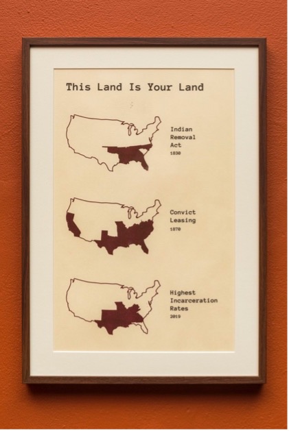
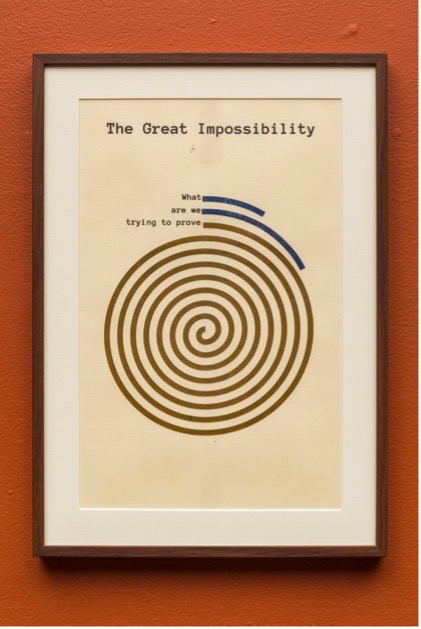
At the same time, it is important to recognize that the existence of racial disparities in, for example, student loan debt, are not the fault of the students themselves, nor should they be the ones consistently tasked with providing more evidence as to its deleterious effects. This is a point made by another contemporary project that is based on Du Bois's charts, by the artist and educator Mimi Onuoha. “In Absentia” consists of six charts that reference the sequence and visual typologies of Du Bois's charts. But the point is not to provide additional evidence of what is already known to be true. Rather, in Onuoha's own words, “the prints form a meditation on interpretability, questioning why such a fact should need proving.” Onuoha's charts follow a similar progression to those in Du Bois's Georgia Negro series, in styles that recall if not directly replicate the typologies original charts. Maps in small multiples, similar to those that Du Bois employed to begin the series, document for example the spatial relation between the Indigenous lands that were claimed by the US government through the Indian Removal Act of 1830, the locations in which “convict leasing” was practiced in the 1870s—this was the practice of prisons profiting from requiring those they imprisoned to work for private companies with no compensation for (or consent from) the imprisoned themselves—and the states with the highest incarceration rates as of 2019. But rather than continue to provide additional evidence of the unfolding legacy of slavery and dispossession, Onuoha employs Du Bois's more experimental forms to offer commentary on this continual need for evidence. A chart that resembles the spiraling bar-chart of the value of household possessions, discussed above, here consists of lines labeled “What,” “are we,” trying to prove.” A final chart is simply a circle, fully shaded, labeled “A space for truths that cannot be shown.” The chart is titled, “It Could Never Be Large Enough.”
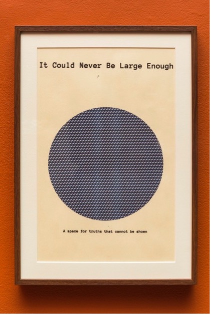
In the context of Du Bois's own writing about the relationship between data and “the truth,” Onuoha's use of this term speaks volumes. It reminds us as those who might seek to create new visualizations that bear witness to oppression, and as those who are eager to celebrate such images—which indeed attest to persistence of the same racism that, for example, enabled Du Bois's charts to be sent ahead to Paris while Du Bois himself was required to travel in steerage, as Battle-Baptist and Rusert document—that we often need no further evidence of many facts, including the foundation of racism that remains entrenched in American life. With this knowledge in mind, we might come to understand Du Bois's charts for how they illustrate another truth: how the arguments mounted through visualization, while often valuable, cannot be left to stand on their own. They must be accompanied by additional methods of knowledge-making, by broader context, and by a commitment to act.
As our project team considered how we might inhabit Du Bois’s revised approach to his research methods, and commit ourselves to pursue the greater knowledge that became his goal, we also knew that we could not claim to understand the full extent of the charge that Du Bois experienced upon hearing the news of Sam Hose’s murder. By the same token, we recognized that we could not uniformly, as a group, understand the effects of anti-Black racism first-hand. But there was an experience that we shared with Du Bois and his students: the fact that we, too, were a majority-student visualization team. And among the lessons that we had learned from our own process of creating the visualizations for this site is that each contributor to the project has their own story, one which helps to further contextualize the visualizations they helped to create—and, therefore, augments the insights that it prompts. We wondered if there might be additional context we might uncover if we brought our own range of methods and disciplinary expertise to bear on the student creators of the charts—and, in turn, what additional knowledge this context might help to prompt.
As have others, we noted the fact that the introductory chart of the second series of charts, the one with national focus, credited the charts' creation to “Negro students under the direction of Atlanta University.” We found it additionally intriguing that the visualization below the introductory text visualized data about Atlanta University students as well.
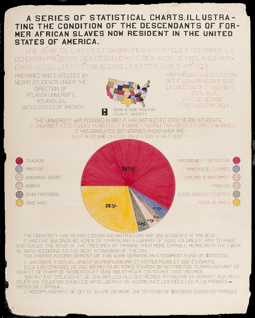
As have others, we noted the fact that the introductory chart of the second series of charts, the one with national focus, credited the charts’ creation to “Negro students under the direction of Atlanta University.”
We found it additionally intriguing that the visualization below the introductory text visualized data about Atlanta University students as well.
The pie chart at the center of the image gives visual form to the occupations of 330 graduates of Atlanta University, all those who had graduated from one of its three degree programs since its founding in 1867 through 1898, the year before the chart was made.
The slices of the pie correspond to four categories of occupation and professional field–teachers, ministers, government service, and business–as well as additional categories for “other professions” and “house wives”—that the graduates would go on to pursue.
While Du Bois does not disclose the source of his data on the chart, the number of graduates matches exactly with the number of alumni listed in the 1898-1899 Catalogue of the Officers and Students of Atlanta University, which Lauren had consulted in her background research. The total graduates and occupations for each type of degree—college, normal, and theological—are summarized in a data table at the end of the book.
In the pages before the table appears, the alumni are listed by degree, and then according to their year of graduation, alphabetically by name, along with their current occupation and place of residence.
Scanning the page which records the earliest graduates of Atlanta University provides fleeting glimpses into their lives. (1) William Henry Crogman, class of 1876, stayed in Atlanta to become a professor at Clark University. (2) Samuel Benjamin Morse moved to Savannah, 250 miles away on the Georgia coast, to become a music teacher. (3) London Humes Waters was deceased.
To bring these traces back into the chart itself, Tanvi first transcribed all of the names and associated information from the scanned version of the catalog into a spreadsheet.
Then, on the basis of Tanvi’s design, Anna and Nick recreated the original chart, placing the 255 alumni with known occupations in the appropriate section of the pie.
Hovering on each dot reveals the person’s name, occupation, and place of residence. Additional categories represent the 35 alumni with unknown occupations, and the 42 alumni who were recorded in the catalog as “Deceased.”
These are the actual people behind the data in the original pie chart, those whose education and accomplishments mattered so much to Du Bois that he devoted the majority of the space of the chart itself to testify to them, and to issue a call for additional funding that would ensure such opportunities for students ahead.
But these were not the same students who themselves created the charts. Their identities are more difficult to pinpoint with precision. An article from the May 1900 Atlanta University Bulletin describes how the work “was done entirely by Negroes--Dr. Du Bois and his assistants, most of whom are Atlanta University graduates.” Du Bois himself provides only a bit more detail, recalling in his third and final autobiographical text, written late in life, “I got a couple of my best students and put a series of facts into charts,” resulting in the “most interesting set of drawings” that were displayed in Paris. And while he goes on to describe the contents of the charts as well as how “the details of finishing these fifty or more charts, in colors, with accuracy, was terribly difficult with little money, limited time, and not too much encouragement,” he does not name any of the students who seemingly helped to ease this challenging task.
Newspaper reportage does name one former student, William Andrew Rogers, as responsible for having “executed” the charts, and the 1899-1900 Catalogue of the Officers and Students confirms this role, listing Rogers's occupation as “Work on Paris Exhibit.” (Rogers had graduated the previous year.) But “based on the volume of the designs, each piece's complexity and detail, and the compressed project timeline,” as Silas Munro confirms, “it seems implausible that Rogers and Du Bois worked alone to complete the project.” The fact that the first set of charts are more sophisticated in their visual design, and more professional in their execution, suggests that Rogers and Du Bois might have worked on the first series together, while enlisting other students in the design and execution of the second set of charts.

If this were true, it would not have been the first time that Du Bois enlisted his own students in a collaborative research project. Among the defining intellectual contributions of the early years of Atlanta University were the Atlanta University Studies, annual data-driven reports on specific areas of Black life that were presented each spring at a large public conference. In fact, Du Bois was recruited to the university in large part to assume direction of the studies, which had begun only two years before his arrival. To complete this work, Du Bois drew from “two tiers of volunteer researchers,” as sociologist Aldon Morris explains: recent graduates of HBCUs across the nation, and his own graduate and undergraduate students. Their work together became the basis for what Morris names the Du Bois-Atlanta School of Sociology, the first “scientific,” or data-driven, sociology program in the United States.
Among the innovations of the Du Bois-Atlanta school was its required coursework. Long before any elite university offered training in data collection or analysis methods, Du Bois instructed his students in a full year of such methods, culminating in a term of applied research on “the social and economic conditions of the American Negro” during their senior year. While there is minimal evidence as to the specific research tasks these students performed, it is generally acknowledged that this coursework was the mechanism by which Du Bois prepared his students for the roles they would play after graduation as unofficial field sites for the data collection required to continue to produce the annual reports.
Several of the charts displayed in the Paris Exposition make use of the data that was collected for the study, The College-Bred Negro, that would be published later that year. The data on the Atlanta University graduates that is visualized in the opening chart, for example, is the same that appears in the published report. Thus while the specific contributions of individual students remain lost to time, we can look up the names of the students who were enrolled in Du Bois's sociology course that year in the corresponding Catalogue. There were four: Henry Napoleon Lee, Lula Iola Mack, Edward Lee Simon, and William George Westmoreland. A slightly revised version of the chart above includes these names, positioned outside of the pie itself, closest to the occupation that—according to their own alumni records—they would soon take on.
But the role of these students in Du Bois's sociological project—and is pedagogical legacy—was not limited to their assistance with collection and analysis of the data that appeared on the charts, or whatever their role in visualizing that data might have been. In the 1909-1910 academic year, Du Bois and a new team of students undertook a follow-up study to the College-Bred Negro, based on a survey of 3856 Black college graduates across the country. Among the responses were 163 graduates of the “college course” of Atlanta University-including the five students who contributed to the making of the original chart. A decade on, their lives had become data that further testified to the enduring value of Du Bois's pedagogical aims.
In this expanded chart that visualizes the data from the 1910 Atlanta University Study, the colorful map that informs the viewer of the location of Atlanta University has been expanded to include the locations of the 140 additional colleges also included in the study.
As in the original, the location of Atlanta University is marked with a star.
In this pie chart, the 133 graduates of Atlanta University as of 1909 with known occupations (as determined by the alumni section of the 1909-1910 catalog) are positioned in the appropriate area of the pie chart. Additional categories represent the nine graduates with unknown occupations, and the 21 graduates who were recorded as “Deceased.”
An additional 3693 gray dots represent the graduates of the other 140 colleges included in the study whose names were not recorded as data. They are placed in the appropriate area as determined by the summary statistics of occupations included in the study. These dots hold space for these students’ contributions to the study, even if we do not know their names.
Here we can see the five students who contributed to the original charts, now placed in the area corresponding to the profession they held in 1909. Lula Iola Mack became a housewife, married to a Mr. F.H. Wilkins, and was living in the city of Athens, Georgia. Edward Lee Simon became a supervisor of industrial work in the Memphis Public Schools. William George Westmoreland stayed in Atlanta, working as a mail carrier. Henry Napoleon Lee, three years earlier, in 1907, was deceased.
There is little more that we can learn about Lee's abbreviated life from the extant data. The catalogs of the years after the Paris Exposition show that, evidently, Lee moved to Memphis with Edward Lee Simon immediately upon graduation. While Simon became the superintendent of the printing department at LeMoyne Institute, Lee worked as a teacher in the industrial department of the same school. The next year, he moved to Denver, then to Hot Springs, Arkansas, then back to Atlanta. In 1905, he was working in Macon, Georgia, as a teacher at the Ballard Normal School, along with several other alumni of Atlanta University who had found employment there. According to the catalog, Lee lived and worked in Macon until he passed away.
There are many questions we might think to ask about Lee and his abbreviated life—about his reasons for traveling the country, about his experiences in those far-flung locals, and his relationships with the other Atlanta University alumni who welcomed him as a colleague when he returned to his home state. But the answers to these questions are not found in the extant data. This truth, to return to Onuoha's formulation, is likely not recorded as data at all.
Yet there are other truths we might gesture towards with our visualization work. In addition to the quantitative data presented in the 1910 Atlanta University Study, there was also data that was qualitative in form.
The survey that Du Bois and the seniors in that year’s sociology course created, and sent out across the United States, in addition to soliciting information about their lives and accomplishments that could be compiled as statistics, also included four questions that encouraged long-form response.
These included their thoughts on their own “early life and training,” their plans to educate their children, the “chief hindrances” they had faced, and their “present practical philosophy in regard to the Negro race in America,” which was abbreviated in the published study as “philosophy of life.”
About 800 responses to the survey were received, which were published in the 1910 study.
We visualize these four sets of responses here. Each of the responses are represented as a dot, placed under the appropriate question.
Clicking each dot displays a key phrase from the response it represents.
Clicking on the phrase reveals the full response from which it is drawn, providing a window into that person’s thoughts even as they remain unnamed.
Thus we close this chapter, and this project, with our own contribution to Du Bois’s project: a visualization of the meaning-making power of data, which we hope also holds space to acknowledge the limits of what data--and, by extension, data visualization--could do.

Conceptual takeaways
- Always recall the power of visualization (again)
- Consider when that power should be aligned with political goals
- Consider how to combine visualization with a commitment to act
- Reorient towards a goal of knowledge or justice, not visualization itself
Practical takeaways
- Align your visualization projects with your values
- Honor and credit the contributions of each team member
- Consider how to combine visualization with other knowledge-making forms
- Know that change also requires a commitment to act