Data visualization has never been neutral or objective. There is a meaning — and an argument — conveyed through each visual design.
We can only imagine the choice words William Playfair (1759-1823) exclaimed when he realized the error that he had engraved into his most recent chart, "Exports & Imports to and from all of North America." It was 1801, twelve years since Thomas Clarkson had first published his slave ship diagram, and fifteen since Playfair had published the first edition of The Commercial and Political Atlas, in which an early version of his own chart first appeared. Engraving was then, as now, an incredibly time-consuming process. Albrecht Dürer, the Renaissance printmaker credited with elevating engraving into an art form, took over three months to complete his famed Knight, Death, and Devil (1513), a print not much larger than an iPad. In the case of Playfair, however, it was not merely the time he had invested in producing the twenty-eight plates for the third edition of his Atlas; it was also the expense.
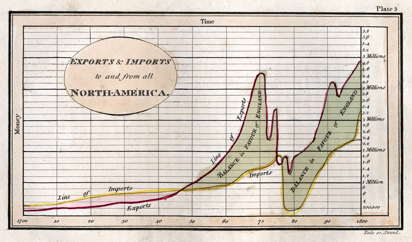
Today, Playfair is widely celebrated for his leading role in the development of modern data visualization. His bar charts, pie charts, and time series charts are frequently heralded as among the earliest of their kind. In the opening lines of The Visual Display of Quantitative Information, visualization luminary Edward Tufte describes Playfair's work as "remarkable," and most other historians of visualization have followed suit. But in his own time, Playfair remained "largely unacknowledged" for his innovations. More to the point, he was almost always nearly broke. And so while Playfair chose to commission one of the most skilled engravers in all of London, Samuel John Neele, to produce the plates for his book, he also likely requested that Neele work at speed so as to minimize the costly detailing and other flourishes for which he was known. It is hypothesized that Neele engraved the charts' decoration, framing, titles, and other lettering, leaving Playfair—who had previously trained as an engineer—to engrave the lines of imports and exports by himself.
To produce engravings like Playfair's, a thin copper plate is first coated with a "ground": a layer of wax, varnish, chalk, or soot. Using a stylus, the engraver traces an outline of the design in mirror image into the ground. The wax (or equivalent) layer is then removed, but a faint impression remains, which the engraver then uses as a guide to carve the image into the copper plate. The engraving is made with a metal tool called a burin, which, somewhat counter-intuitively, is held still while the engraver rotates the underlying plate. Playfair's error was thus a common one, a slip of a tired or sweaty hand. It wouldn't even be very noticeable one the colored paint was overlayed. But neither of these excuses would have made it more tolerable to the man who was already, by his own account, "long anxious" to be acknowledged for the "invention" of data visualization. Unlike the array of software platforms and programming libraries used to create data visualizations today, each of which allow for (relatively) easy revision, the engraving process employed by Playfair resulted in an image that was irreversibly inscribed into copper. When we also consider the time and money invested in the work, it might as well have been set in proverbial stone.
This chapter takes up the processes involved in transforming data into image, material as well as conceptual, in order to continue our exploration into the relationship between data and its visual display. While it's easy to assume that any particular visualization—or, at least, any good one—offers a direct representation of the data underneath; that its visual form is neutral; and that there is no additional significance imparted by the choice of visual form, these are each only assumptions, as the example of "Description of a Slave Ship" has already begun to confirm. Turning now to Playfair's canonical time-series charts, so often upheld as the epitome of the form, will allow us to see how all visualizations of data carry with them additional meaning—meaning. This meaning is, again, not neutral; it reflects a particular view of the significance of the data, of the value of visualizing it in a particular form, and of the particular people who can most benefit from its insights.
These views—about why, how, and for whom a visualization has been designed—are what we describe in this chapter as a visualization's argument. That a designer may not be aware of the argument that they are making through their design choices does not mean that it is not present, nor does it invalidate the insights that the visualization has been designed to produce. On the contrary, an awareness of this argument enables us, as viewers, to come to a better understanding of what we are actually looking at, and what inferences we may properly draw. Here, the enduring nature of Playfair's time-series charts, including the engraving errors they contain, together lead to the second lesson of this book: that the specific tools with which a visualization is created, and the specific purposes for which—and people for whom—it is designed are sources of insight in and of themselves. By opening ourselves up to these additional insights, and the knowledge that they point towards, we come to see the arguments that are embedded in every data visualization that we on the one hand encounter, and on the other create.
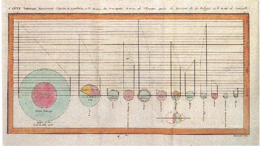
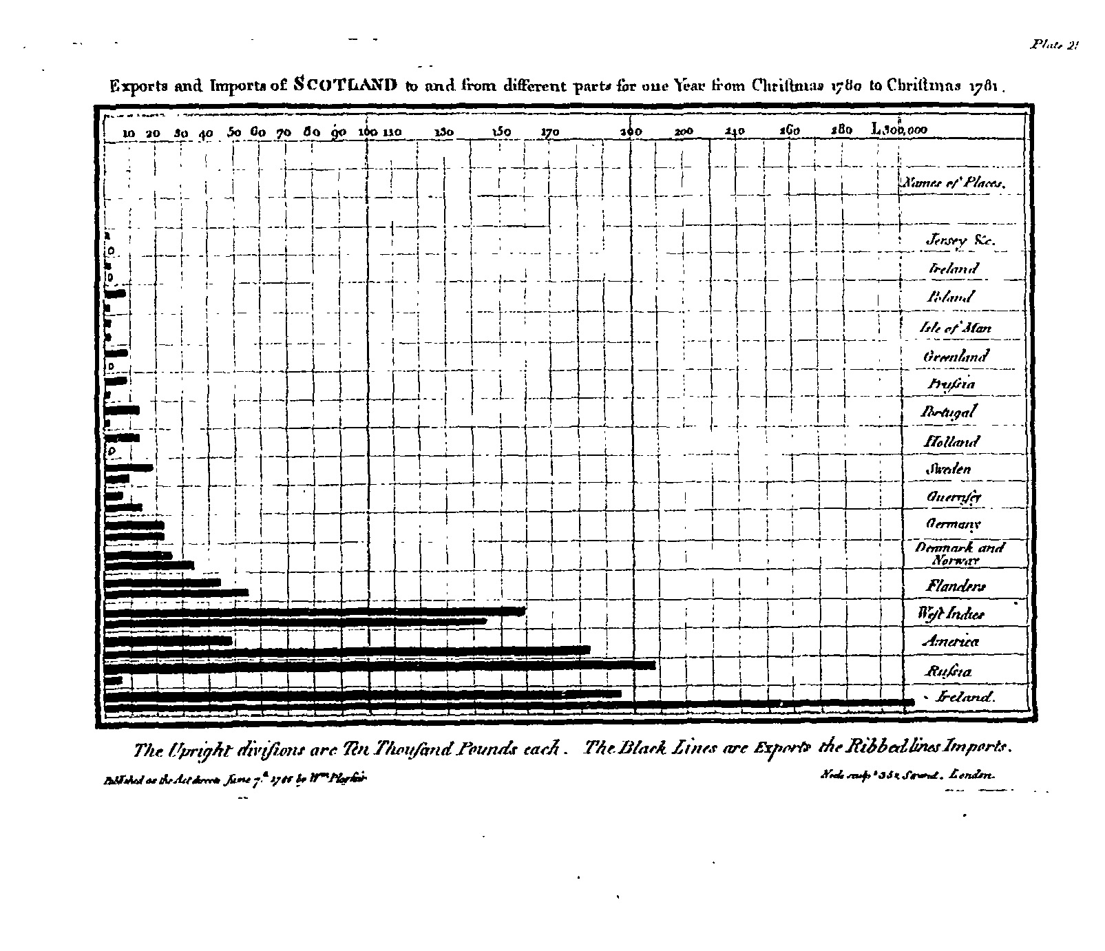
Playfair did not intend to include his charts' underlying data in the Atlas. It was only after soliciting feedback from James Watt, inventor of the steam engine—and for whom Playfair worked in his youth—that he decided to also render the data from his charts in tabular as well as visual form. It might be proper,
Watt advised, to give in letter press the Tables from which the Charts have been constructed… for the charts now seem to rest on your own authority, and it will naturally be enquired from whence you have derived your intelligence.
Playfair thus dutifully compiled data tables to accompany each of his charts, which documented the figures he'd "derived" from the records of the London Custom-House, and included them in the first and second editions of the book.
But by the book's third edition, Playfair had gained enough confidence in the form and function of his charts that he no longer felt obligated to include the associated data tables, as Watt had initially advised. Having reflected on the value of his contributions over the years, Playfair came to see the function of his charts as quite distinct from that of tables, or "figures," as he termed them. In the Introduction to this new edition, he explains:
The advantage proposed by this method, is not that of giving a more accurate statement than by figures, but it is to give a more simple and permanent idea of the gradual progress and comparative amounts, at different periods, by presenting to the eye a figure, the proportions of which correspond with the amount of the sums intended to be expressed.
Playfair is explicit about the fact that his charts are "not more accurate" than his data tables. Rather, he understands the value of his charts as offering something else: an ability to impart a "more simple and permanent idea." As with Thomas Clarkson's writing about his slave ship diagram, here we also see language that reflects an empiricist epistemological view. Playfair believes his chart will present an image "to the eye"—one which, as he explains a few lines later, can then be processed into a "simple and complete" idea by the mind.
In this later formulation, Playfair employs words that even more closely echo Clarkson's language and the empiricist philosophy that it reflects. For example, we might recall Clarkson's stated aim of creating an "immediate impression" in the eyes of his viewers. Here, similarly, Playfair expresses his hope that "a sufficiently distinct impression will be made, to remain unimpaired for a time, and the idea which does remain will be simple and complete." This statement encapsulates Playfair's ideas about how visualization leads to knowledge—in other words, his argument. For Playfair, visualization prompts insights that are "distinct" from the insights suggested by data alone. The knowledge that it leads towards is perhaps "more simple," but it is also easier to understand—and, as a result, easier to remember as well.
Playfair's goal of presenting a "simple and permanent idea," over and above any particular data point, is itself made visible the revisions that he made to "Exports & Imports to and from all of North America" before the third edition of the Atlas.
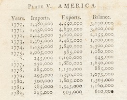
The tables in the first and second editions of the Atlas include annual data for the years between 1770 and 1782. For the years between 1700 and 1770, there is only data for each decade.
He shaded the area between the two data lines in order to illustrate the balance of trade between the two nations. Stippled dots indicate periods of time when the amount of imports from North America to England exceeded the amount of exports from England to North America. Diagonal lines indicate the times when exports from England to North America exceeded imports.
In the accompanying chart, Playfair includes both major and minor gridlines along the y-axis of the chart, but he includes minor gridlines along the x-axis only for the twelve years for which he possesses annual data. Presumably, this indicates the greater granularity of those years’ data.
In the third edition of the Atlas, however, these minor gridlines disappear—along with the data tables.
Playfair extends the endpoint of the x-axis to 1800—what was then the present. In addition, the data-lines become less precise. The lines of imports and exports also become smoother--a reflection of either his desire to convey a more “simple” idea, or his improved engraving technique, or both.
In this edition, he also makes significant improvements to the charts’ design. He replaces the hachure and stippled dots employed in the second edition to indicate the difference between the periods of trade in favor of and against England with hand-stained color.
He (or more likely, the master-engraver Neele) also placed the titles in oval superimposed upon the chart, rather than above, and decided to remove the explanatory notes about the charts’ scale.
He labeled the axes and modified the scale markers of the charts—each of which also improved legibility.
The overall effect was to solidify the authority of the “simple and complete idea” that he envisioned from the start.
Playfair's belief in the simplicity and ease of data visualization has carried forward into the present, along with "permanent" visual impressions made by his iconic charts. This is perhaps most evident in the work of Edward Tufte, whose influence over the field of data visualization is impossible to overstate. It is largely because of Tufte, who himself bolsters his claims with Playfair's writing, that we maintain the belief that the best visualizations are "clear" and "efficient"; that this clarity and efficiency is synonymous with accuracy; and that an absence of embellishment or superfluous detail is how to best encourage the viewer to think about the "substance" of the data, rather than the "methodology" underneath. These best practices are, for Tufte, how visualizations can be made to "reveal data" (italics in the original). But for Playfair, what is revealed through this particular approach to visualization is the value of visualization itself. This value is indeed clarifying, and it is efficient as well, but it is an argument and not a fact. As visualization researchers begin to move on from Tufte's basic teachings, it becomes all the more important to recognize that ease and efficiency are not any essential qualities of data visualization. Rather, they reflect only one view—Playfair's—of why and therefore how visualizations should be designed.
Playfair created his charts in an era of intense political change. At the time that he released the third edition of the Atlas, the French Revolution had only just come to a halt, the result of a coup staged by Napoleon Bonaparte (who would himself go on to inspire Charles Minard's iconic flow-map as discussed in the Introduction). The Haitian Revolution was still underway; it would not resolve until three years later, in 1804, with the founding of the Republic of Haiti. Meanwhile, the effects of the American Revolution still lingered in the minds of the European elite as they pondered the possibility of additional colonial revolts. And so when Playfair explains that he has "chosen the present moment" to re-release his book because of the "singularity of the situation in which Europe is now placed," it was this specific moment—of political uncertainty and upheaval—which he implicitly describes.
This context helps to illustrate how Playfair also saw his work as a political intervention, a means of countering the instability that the Age of Revolutions had brought about. We have seen this view of visualization before, in the form of Clarkson's slave ship diagram. But whereas Clarkson had a clear view of the more equitable society that he designed his chart to bring about, Playfair was openly unsure about what he thought the future might hold. In the preface to the third edition, he speculates that "Europe may probably be convulsed with war for fifty years to come," but pronounces it "impossible" to determine whether he and his compatriots are witnessing the end of their cultural and economic dominance, or whether Europe's "art and commerce" will prevail.
It is because of this uncertainty, I contend, that Playfair places tremendous value in the clarity of perspective produced by his charts. As he explains:
If [a future of war] turns out so, a picture of the past will be a valuable thing, if, on the contrary, commerce should still continue its progress, this will make the first part of a great whole, which, when completed on some future day, will be a most valuable work.
From these lines, it would seem that Playfair believes that his "simple and complete" images can not only capture a clear "picture of the past," but also retain their utility in a range of possible future scenarios. His goal is to cut through complexity, guided by a belief that less detail—rather than more—is what will enable more "useful" and enduring knowledge.
But a pair of questions remains: for whom is this knowledge truly useful, and for what reasons is it necessary that this particular "picture of the past" endure? As Playfair elaborates the impetus behind the "form and manner" of his charts, he makes clear that his intended audience is not "any person" in the world, but rather, the narrower demographic of "men of high rank, or active business" These men, he continues, "can only pay attention to general outlines; nor is attention to particulars of use."
Their concerns are not with complexity, or with individual impact, because their rank and resources shield them from any personal fallout from the events represented through the charts. The knowledge that is recorded and visualized in the Atlas is valuable to them precisely because it is clear and efficient, and because it allows them to ignore any details that might otherwise cloud their view. The result of this picture is a further consolidation of their political and economic power, which directly follows from the clarifying and consolidating design of the charts themselves.
How, more concretely, is this consolidation of political and economic power achieved? We might now contemplate the "particulars" of the chart at the center of this chapter, "Exports & Imports to and from all of North America," which Playfair chose not to give visual form. We might also now consider the chart that directly precedes it in the Atlas, "Exports & Imports to and from the West Indies," and ask ourselves of what, more precisely, do these exports and imports consist? Among them are people, as we learned in Chapter 1, the enslaved human labor which the "balance of trade" of the British empire depended upon.
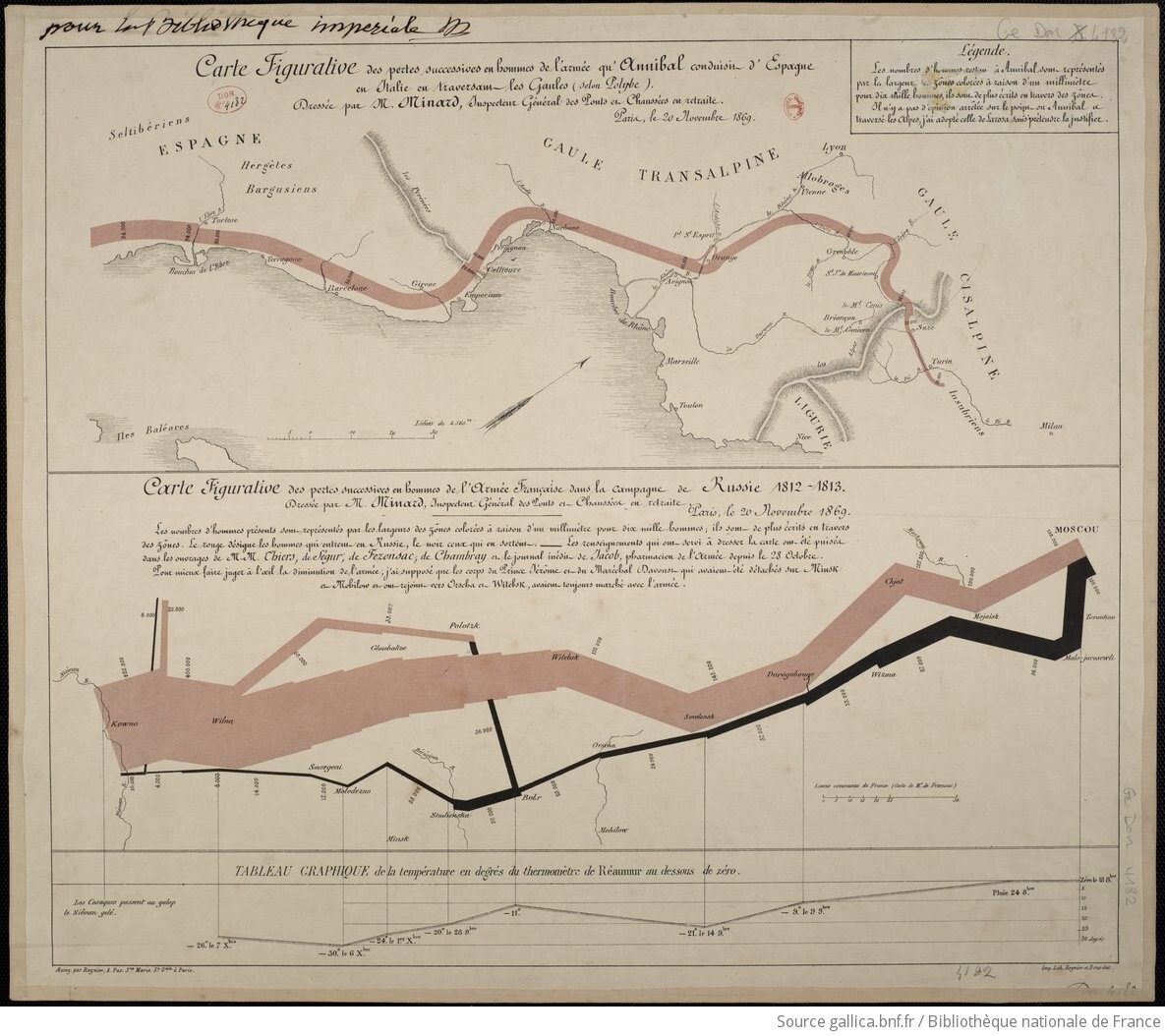
It is only in the final paragraph of the two-page explanation of the chart of the West Indies that Playfair connects the balance of trade that favors England, as depicted in the chart, to the "lives and freedom of the much injured, and wretched inhabitants of Africa." In the much longer and more impassioned account of the chart of North American trade, Playfair does not mention the issue of slavery at all. For Playfair—and, he believes, for the "men of high rank" for whom he has designed his charts—it is truly the failure of Britain to hold onto its American colonies, and the loss of profit and power that came with it, that is most deserving of their ire. The chart's design reflects this assessment, and explicitly so. "What numbers have been ruined, and how many more have been deprived of fortune, by our ill-conducted trade with America?" Playfair laments. There are no captive bodies here to illustrate this "ill-conducted trade." On the contrary, his boldly-colored data-lines emphasize the "numbers" and the "fortune" lost. The exclusion of "particulars" is what makes the chart's interpretation quick and "easy."
To be clear: very few of the myriad people who employ time-series charts today do so with the same political motivation as Playfair. It is unlikely that they are even aware of the context of the charts' creation at all. But they—and we—would be well-served by recognizing the argument associated with their original design: about what can be gained from a single "simple view," and about who can benefit from it. Given his own social and intellectual milieu, it is not surprising that Playfair offers no concern about what might be lost in the details of the data, or about who might be impacted by that missing information. What is surprising is that we, in the present, have not yet come to see these design choices as theargument of Playfair's charts.
Perhaps this is due to the design of the charts themselves: how the bold data lines, enhanced by the hand-tinting that shades the areas between them, and set against the stark black gridlines, emblematize the graphical authority that visualization can command. Indeed, this is a large part of how data visualization accrues its power, as we learned in Chapter One. Here, the ornate title and formal frame—design choices made by Playfair or in consultation with Samuel Neele, the charts' engraver—further reinforce the impression of an authoritative image of enduring significance, as well as the seeming objectivity of the data it contains. As viewers, we are not prompted to question the data that we see visualized on the chart, nor are we pushed to extend our inquiry beyond the "simple and complete" view that Playfair himself proclaimed his charts to show.
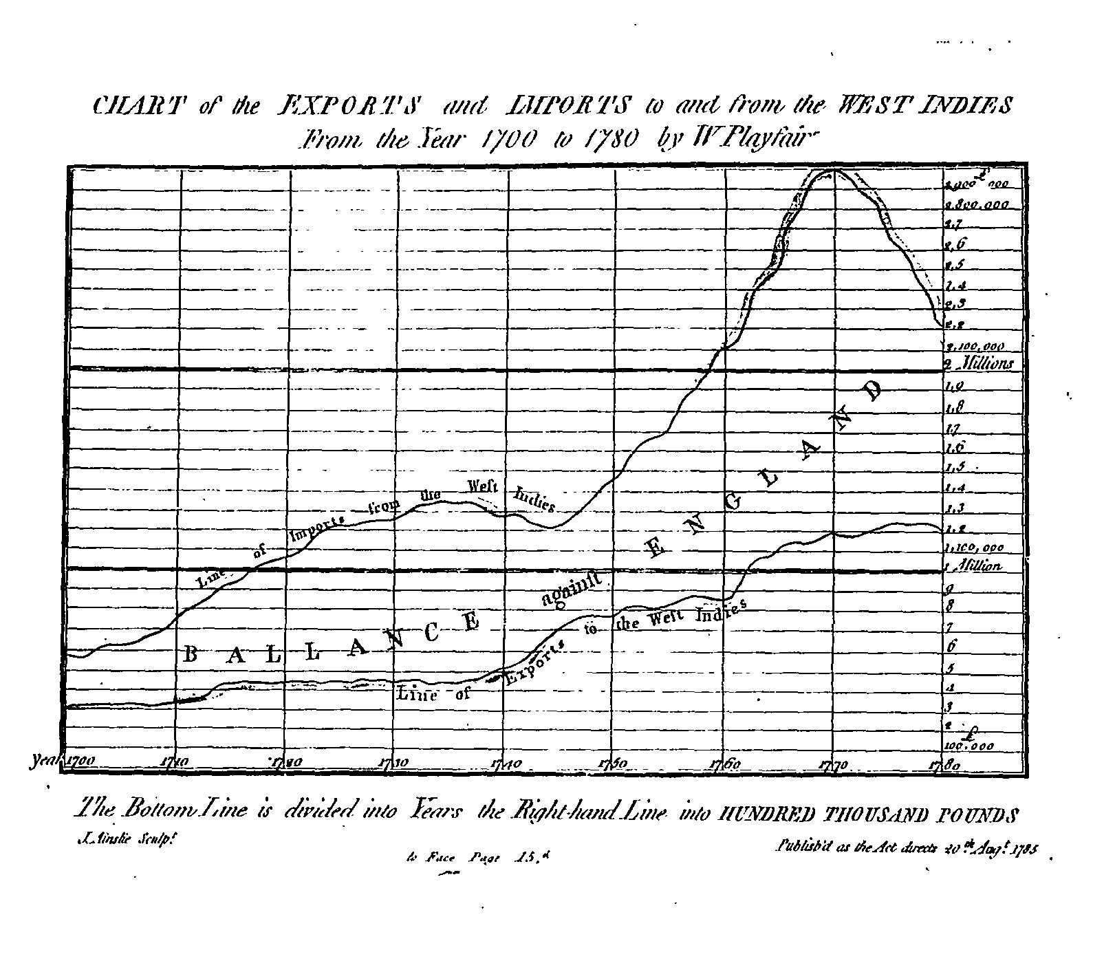
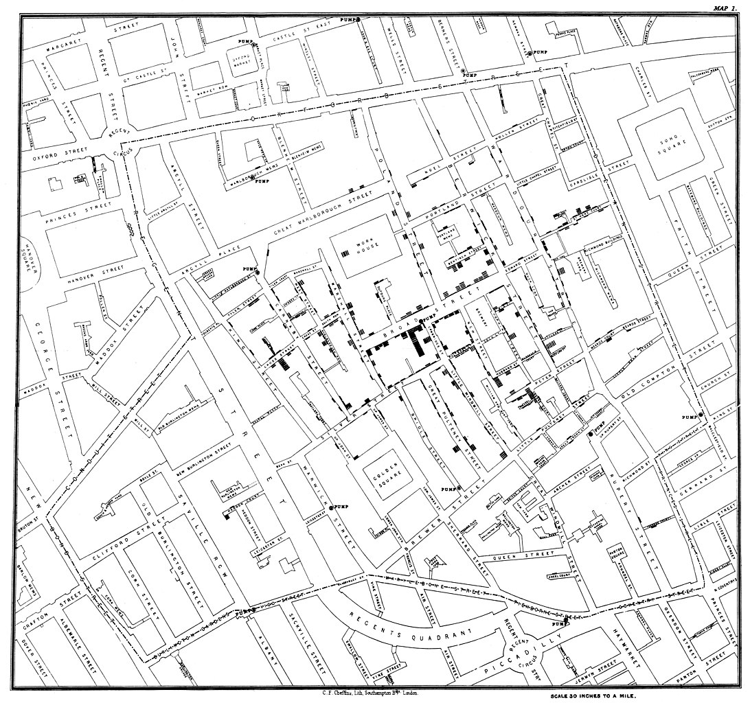
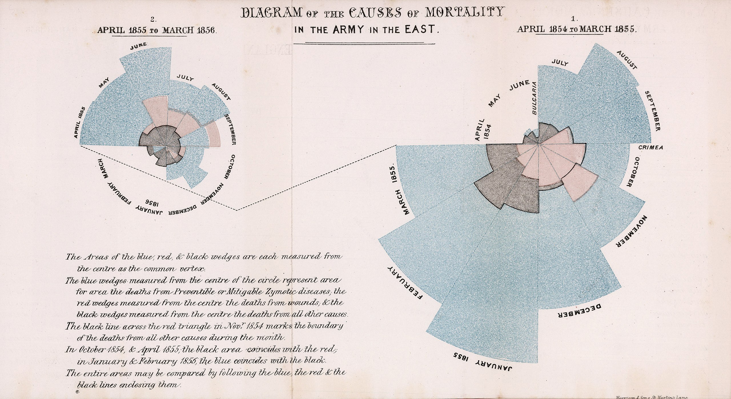
From our perspective in the present, it appears that Playfair was correct in his assertion about the enduring nature of the "form and manner" of his charts. His are among a small set of data visualizations from the nineteenth-century—also including John Snow's 1854 dot map of cholera deaths, Florence Nightingale's 1858 coxcomb charts of mortality during the Crimean War, and Charles Minard's 1869 flow map of Napoleon's march on Russia, as previously discussed—that are consistently held up as early exemplars of the affordances of graphical display. But in contrast to Snow, Nightingale, and Minard, whose innovative visual forms are inextricable from the arguments about their specific datasets that they designed their charts to make, Playfair's charts are most commonly presented in the service of a more general argument about the uses and value of visualization itself.
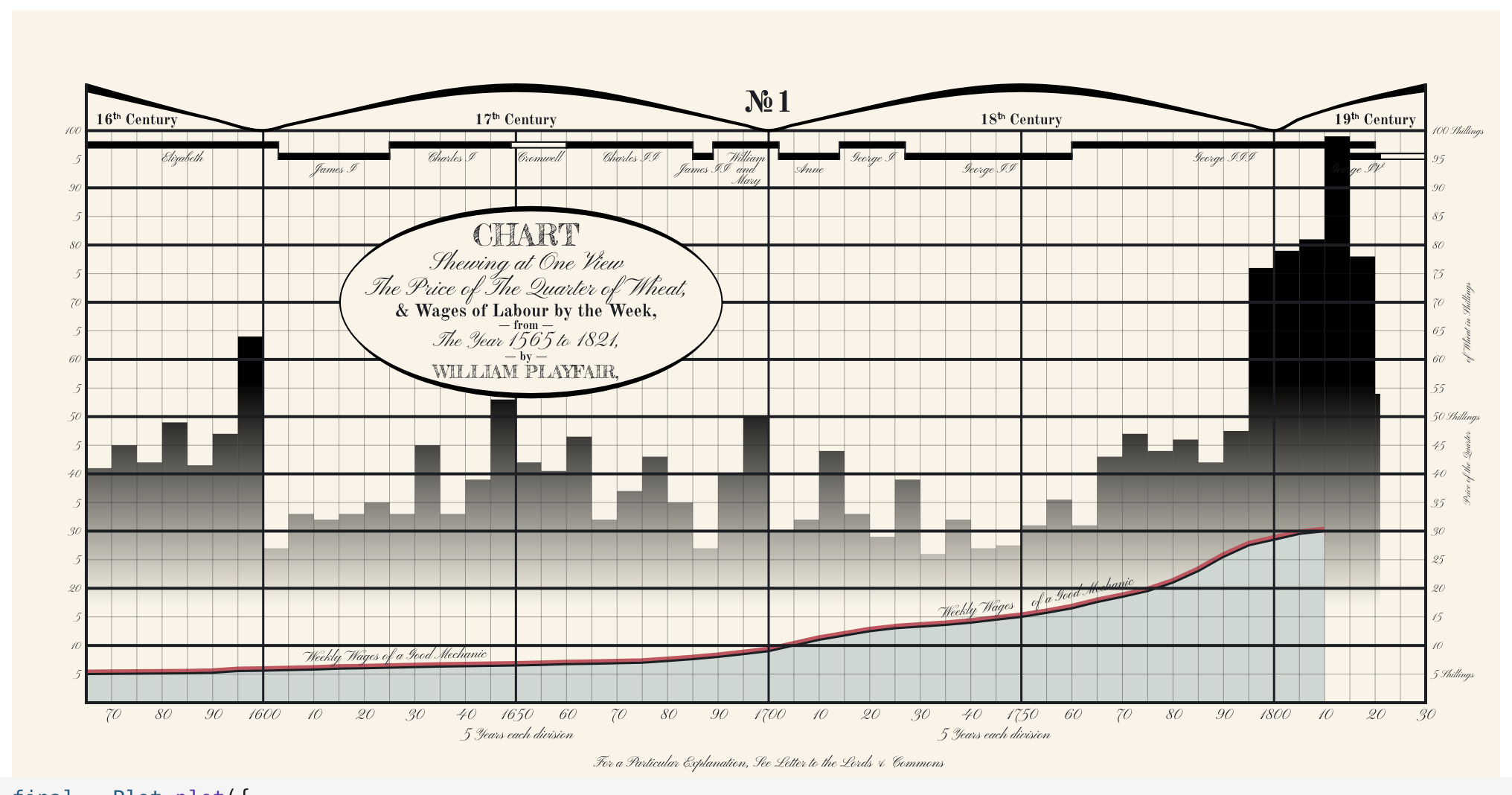
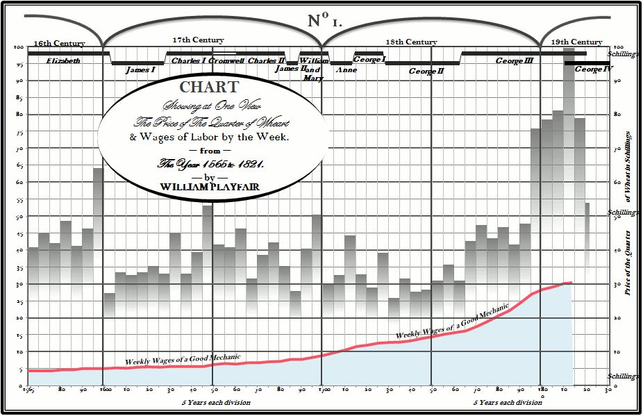
This broad applicability—another consequence of Playfair's simplifying view—may be the reason that so many contemporary visualization designers have been drawn to the challenge of recreating Playfair's charts, as have many designers of new visualization tools. For the tool designers, it would seem, Playfair's charts bolster their own graphical authority, placing their work in the direct lineage of Playfair. For the designers who use these tools to recreate Playfair's charts, the same theory holds. But there exists an another layer, one that derives from the art-world model in which students attempt to emulate the masterworks, hoping to lend evidence to their own technical mastery. Here there exist many examples of distinction, ranging from the expert exploration offered by Jo Wood in an Observable notebook, to the surprising verisimilitude achieved by Jorge Camoes using Microsoft Excel. These charts and the technical feats they represent are indeed impressive, and deserving of all the accolades they earn online. But as with Playfair's original charts, their composition processes can also tell us even more.
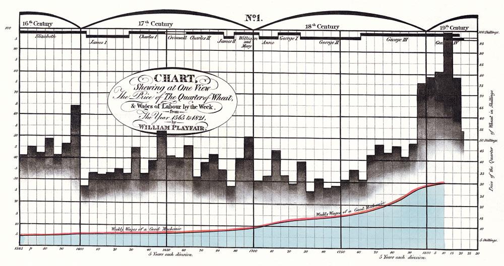
More specifically, these re-creations of Playfair's charts together point to a new argument about the uses and value of visualization, one that diverges in important ways from the argument made by Playfair through his original charts. This argument stems from the basic fact that, among the wide array of present tools for visualizing data, it is nary impossible to create a visualization without having a dataset first. This structural dependency on the data is, for the most part, a very welcome development; it ensures the fidelity of the visualization to the data it represents, and it (generally) enables the designer to experiment with multiple visual forms before selecting the one that they believe represents the data best. It also means less steep of learning curve and less financial investment than Playfair himself required—as well as, presumably, less sweaty hands. But this dependency on the data is not merely one of convenience; it also represents an epistemological shift, and for this reason it is worth exploring more.
As an entry-point, consider our project team's own process of recreating Playfair's " Exports & Imports to and from all of North America" with D3, the popular JavaScript-based visualization library, as we did for the feature at the beginning of this chapter. Unlike the data-lines of Playfair's original chart, which as previously discussed, he drew freehand, ours required actual data before they could be given visual form. Because of this, we were required to type in the data from Playfair's tables and structure it in a file format that D3 could parse. Only then could we plot the points on our chart—a very different process than Playfair himself employed.
But plotting Playfair's datapoints was only the beginning. While it generally takes only a single line of D3 code to plot a path from one point to the next, Playfair's data-lines contained more curves than were recorded in his tables. Because our goal was to recreate Playfair's chart with fidelity to the image, and not to the data tables that Playfair himself removed, we needed a way to convert his data-lines back into data that we could plot. To do this, we first imported a high-resolution scan of the original image into Adobe Photoshop, then traced the data-lines with a digital pen so that we could save them as vector-based paths. We exported each path's coordinate vector from Photoshop as a standalone file, which we then imported back into D3 as data. Only then could we plot Playfair's data-lines on the chart as they are currently shown.
If this process seems convoluted, that is a large part of the point. It underscores the degree to which D3 depends on data, and in so doing, exposes its epistemological claim: that the knowledge we gain from visualization largely depends upon the data underneath. The name "D3" itself supports this claim. Its three Ds stand for "Data-Driven Documents," an indication of the creators' view—indeed, their argument—that any insights prompted by the act of visualizing data, and any knowledge those insights might point towards, are primarily "driven" by the data itself.
But as Playfair's original charts help to show, there are additional insights—and knowledge—that emerges from the act of visualization as well. In Playfair's case, these have to do with the value of the "simple view," and its utility for those who lack the time or the inclination to be distracted by detail. These are not intrinsic features of the data; they derive from Playfair's choices in how to put that data on display.
Another example from this project may help to underscore this point. Consider the data of the project itself, visualized in Playfair's time-series form. The data sources represent the tools and platforms involved in the making of this site: Zotero, which I used to store my notes from my research trips to archives; Google Drive, which we used to store drafts of the chapters' text as well as meeting notes, design documents, and other files related to the project overall; Figma which we used to design the site and its interactive features; GitHub where we store the code; and iCal which represents a (partial) record of the human labor of the project, in the form of the range of meetings that were held to discuss the progress of the site.
Plotting the Zotero data against the GitHub data over the years between 2013 and 2024, when this project took place, the immediate impression is of how each source dominates its own particular time span.
The first year of the project is characterized by a profusion of Zotero data, corresponding to the beginning of the archival research.
Between 2016 and 2018 is a gap, when my attention was elsewhere.
In 2018, the implementation work begins, gradually increasing through the project's final release. Even as this image presents the lifespan of the project in a “single view,” it is not the source of the data's most generative insights.
But plotting the iCal data against the GitHub data affirms the value of visualization when a particular dataset is aligned with an appropriate visual form.
Here we see the introduction of the web development team in 2017, and with it, the rise in contributions to the project's codebase.
This is set against the weekly meetings that also began in 2017, with the expansion of the project team.
The contrast between the cyclical structure of the meetings data and the upward slope of the GitHub commits accentuates the two major structuring forces of the project: the first the consistency provided by the steady rhythm of the weekly meetings, and the second the increasing momentum generated as the project progressed.
A third comparison, between Figma and GitHub, reflects the further maturation of the project, when Tanvi, a trained designer, joined the team.
The Figma data begins only in 2019, when Tanvi introduced it into the project's workflow, but plotted against the GitHub commits, a lead-lag relationship soon begins to emerge.
This reflects the process by which Tanvi would complete the design work for a feature and then pass it off to the development team
The picture that this chart presents to the viewer is indeed revealing, but it remains only a "single view." Created not through copperplate engraving but, instead, through D3, it hides the process of its own making and with it, evidence of the decisions made about the data on display. There were many earlier iterations of these charts, involving different datasets and different visual forms. But in the end, this view is what remains—a single view, and nothing more. For this reason, it becomes all the more important to ask the questions raised by Playfair's chart: about not only how but why it was designed, as well as who it was designed for.
Playfair clearly longed to be recognized for his graphical innovations. In 1787, one year after the initial publication of the Commercial and Political Atlas, he authored an account—almost certainly fictitious—of a dialogue between Benjamin Franklin and Joseph II, Holy Roman Emperor. Published with the dialogue was a set of letters, one of which included an endorsement on the part of Franklin—again, very likely fictitious—of Playfair's visual method of display: I have begun to practice the mode here,
writes Playfair in the voice of Franklin, and it throws light on the state of our accounts, as if by inspiration, one minute giving a much clearer idea of the matter, than whole days and weeks without this simple invention.
The reality, of course, was that Playfair's "simple invention" would go unrecognized for over a century. Playfair himself died somewhat disgraced—and still financially insolvent—after being implicated in an international embezzlement scheme. While his charts retained some adherents—most notably, Alexander von Humboldt, who will be discussed in the next chapter—they were largely forgotten until the second half of the nineteenth century, when the British economist William Stanley Jevons borrowed Playfair's visualization techniques for his own economic atlas, which was circulated among the British statistical elite. Among this group was Karl Pearson, the influential statistician and eugenicist. Pearson's use of charts and graphs to illustrate his own statistical work is generally viewed as a watershed moment for scientific visualization, after which point textbooks as well as histories began to proliferate. These histories, in turn, became the sources for Tufte's work, who found in Playfair an exemplar of "graphical excellence" whose aesthetics aligned with his own modernist mien.
The fact that Playfair's charts now hold a highly visible position in the field of data visualization would have given him great pleasure. That his charts are not only widely recognized for their historical contributions to the development of the field, but also so often recreated with contemporary tools, attests to the enduring "value" of the charts that he envisioned in his Atlas. And yet the value of the charts is not the particular "picture of the past" that they preserve for posterity, however clear and efficient it may be. Rather, their value rests in the "form and manner" in which those pictures were created. Indeed, the value of Playfair's charts, in the present, has in many ways become synonymous with the value of visualization itself.
Because of this, the error that Playfair inscribed into his chart of "Exports & Imports to and from all of North America," which has led us to this chapter's final claims, has receded into history. This is compounded by the fact that our current tools do not produce the same types of errors as to which copperplate engraving was prone. Today, visualizations in their final form bear few visible traces of the processes of their production—of their many iterations, myriad design tweaks, and copious modifications to the code. Yet we would remain well-served by asking the same questions prompted by Playfair's engraving error: about the processes—both technical and conceptual—that contribute to their making, and the resources they require; and about the human labor that is required—both physical and intellectual—that contemporary visualizations also require. The answers to these questions not only "humanize" the process of visualizing data, but also point to the arguments embedded in each visualization's design: about its value and its uses, as well as who those uses and that value is envisioned for. While today, these arguments may not be, like Playfair's, made visible on the surface, they nevertheless remain contained with each visualization's depths.
Conceptual takeaways
- Presume that visualization is not neutral
- Consider the context that might inform the choice of visual/interactive form
- Consider the nature of the insights that are prompted by that particular form
- Ask who will most benefit from them
Practical takeaways
- Examine any assumptions about your viewership
- Accept no best practices by default
- Consider which visual/interactive forms your tools enable
- Consider which forms they do not